How we fixed the foundation for scalable church software

Design inconsistencies compound quickly in growing products. What starts as a few visual variations across features eventually becomes a barrier to efficient development and cohesive user experience.
Text in Church knew this challenge well.
Their cloud-based platform helps churches stay connected with their communities through modern communication tools. The mission was solid. The features were there. But as the platform grew, design consistency had become increasingly difficult to maintain.
Previous agency work had created a gap between design files and the live product. Without a centralized design system in place, each new feature was being designed somewhat independently, leading to visual variations across the platform. The team recognized these patterns and knew they needed infrastructure to support more systematic design.
"Before we started using Tenscope, we didn't have cohesive designs, a design library, or anything in place to support success. The biggest benefit we've found with Tenscope is the consistency in the designs. For the longest time, we struggled with that."
Caleb Miller, Director of Product & Experience
Text in Church needed a design system, organized workflows, and a sustainable foundation that could scale with their growth.
Diagnosing the opportunity
We ran a comprehensive audit to understand the current state and map the path forward.
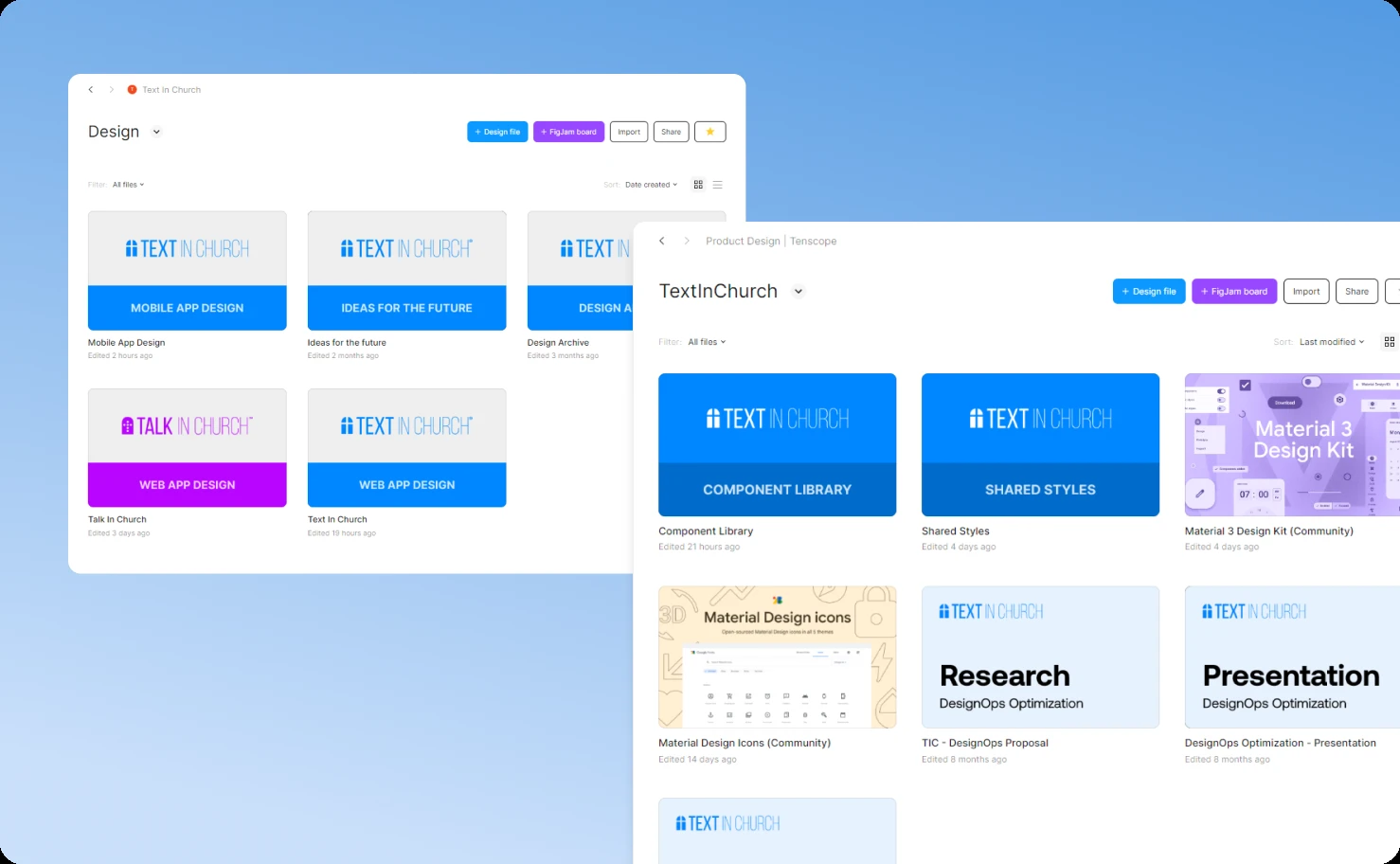
File organization: Design assets had accumulated organically as the product grew. Files lacked consistent naming conventions and structure, which made navigation slower and impacted performance. Years of design iterations were mixed with current work.
Missing design system: Without a component library or design tokens, there was no single source of truth. Each screen had been designed individually, which naturally led to visual inconsistencies across the platform.
Documentation gaps: Design patterns and standards weren't formally documented, making it difficult to maintain consistency as new features were added or new team members came onboard.
Handoff process: The transition from design to development could be more streamlined. Better alignment between teams would reduce back-and-forth and speed up implementation.
Standardization needs: Without unified design principles, consistency depended heavily on individual judgment rather than systematic guidelines.
We used an impact-effort matrix to prioritize these opportunities. File organization was high-impact and medium-effort—a perfect early win. Comprehensive design documentation would follow once foundations were established.
The workshop with Text in Church's team confirmed they understood these challenges and were ready to invest in systematic solutions.
Phase 1: Archaeological excavation
Before building anything new, we had to clean up the mess.
The "housekeeping session" sounds boring but was essential. We combed through every design file, identifying what was current, what was deprecated, and what was mystery garbage nobody remembered creating. Outdated assets got archived. Redundant screens got consolidated. Active work got separated from historical artifacts.
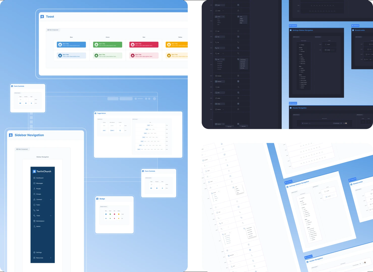
Then came the restructuring. The previous approach—everything dumped into one giant file—was replaced with a logical folder system: Text in Church (main platform), Talk in Church (communications module), Component Library (design system), Mobile App Design (native apps), and Archive (historical reference).
This wasn't cosmetic organization. It was operational transformation. File performance improved. Navigation became intuitive. New team members could find what they needed without asking for help.
Phase 2: Building the system that should have existed
The design system became our north star.
We built a component library from the ground up, cataloging every UI element across the platform: inputs, buttons, cards, modals, navigation patterns, data displays, everything. Each component was designed once, documented thoroughly, and made endlessly reusable.
Design tokens established the visual language: color palettes, typography scales, spacing units, shadow depths, border radii, animation timings. Changing a token propagated changes everywhere automatically. Want to adjust the primary blue across 50 screens? Change one token value.
Responsiveness was baked in from the start. Every component adapted gracefully to different screen sizes. Breakpoints were standardized. No more guessing how mobile should differ from desktop.
We also architected the system to support light and dark themes simultaneously. Churches have different preferences and different contexts for platform use. The system needed to accommodate both without duplicating work.
This wasn't about making things pretty. It was about making things sustainable. A proper design system means new features ship faster, look consistent, and require less designer time to specify and less developer time to build.
Phase 3: Fixing how humans work together
Systems and files don't design products. People do. And people need processes.
We established regular touchpoints between design and development teams. Reviews happened on predictable schedules with clear agendas. Designers shared early-stage work to surface technical constraints before finalizing details. Developers provided feedback on feasibility and asked questions before building.
Decision-making authority got clarified. Design ownership meant designers specified the what and why while developers determined the how. Ambiguous situations had escalation paths. Nobody operated in a vacuum anymore.
The review process became structured: design intent presentation, technical feasibility discussion, feedback consolidation, approval, and handoff. Everyone knew what information was needed at each stage and what constituted "done."
Communication transformed from sporadic and reactive to consistent and proactive. Problems surfaced earlier when they were cheaper to fix. Trust rebuilt because everyone could rely on clear expectations.
Phase 4: Applying the foundation to the product
With infrastructure solid, we redesigned the product experience itself.
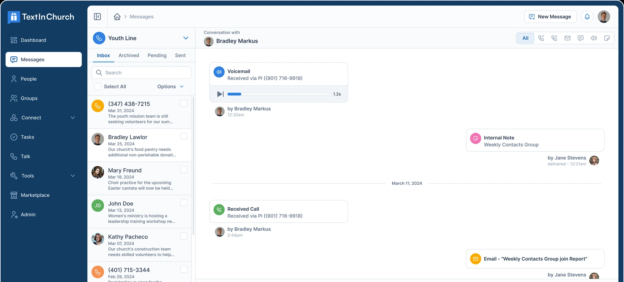
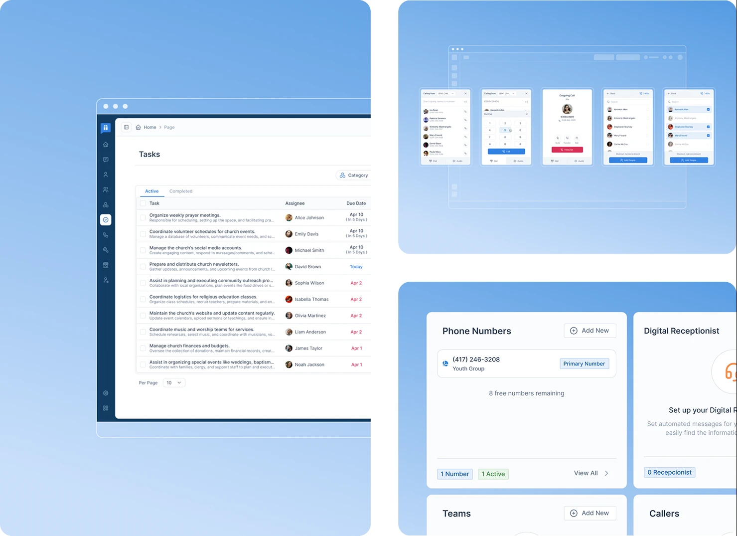
Key features across Text in Church's platform got refreshed using the new design system. Navigation became coherent. Visual language unified. Interactions followed predictable patterns. The platform finally felt like one cohesive product instead of a collection of separately-designed features.
The mobile app received significant attention. Church members primarily access the platform on phones—checking announcements, reading messages, staying updated. The mobile redesign applied the same design system as desktop, ensuring consistency across contexts while optimizing for touch interactions and smaller screens.
The design philosophy centered on approachability. Churches aren't tech companies. Their staff and members span huge age ranges and technical comfort levels. Every interface decision prioritized clarity and friendliness over sophistication. Warm colors. Clear labels. Forgiving interactions. Help text when appropriate.
The platform needed to feel like a friendly assistant, not an intimidating dashboard.
Building a website that matches ambition
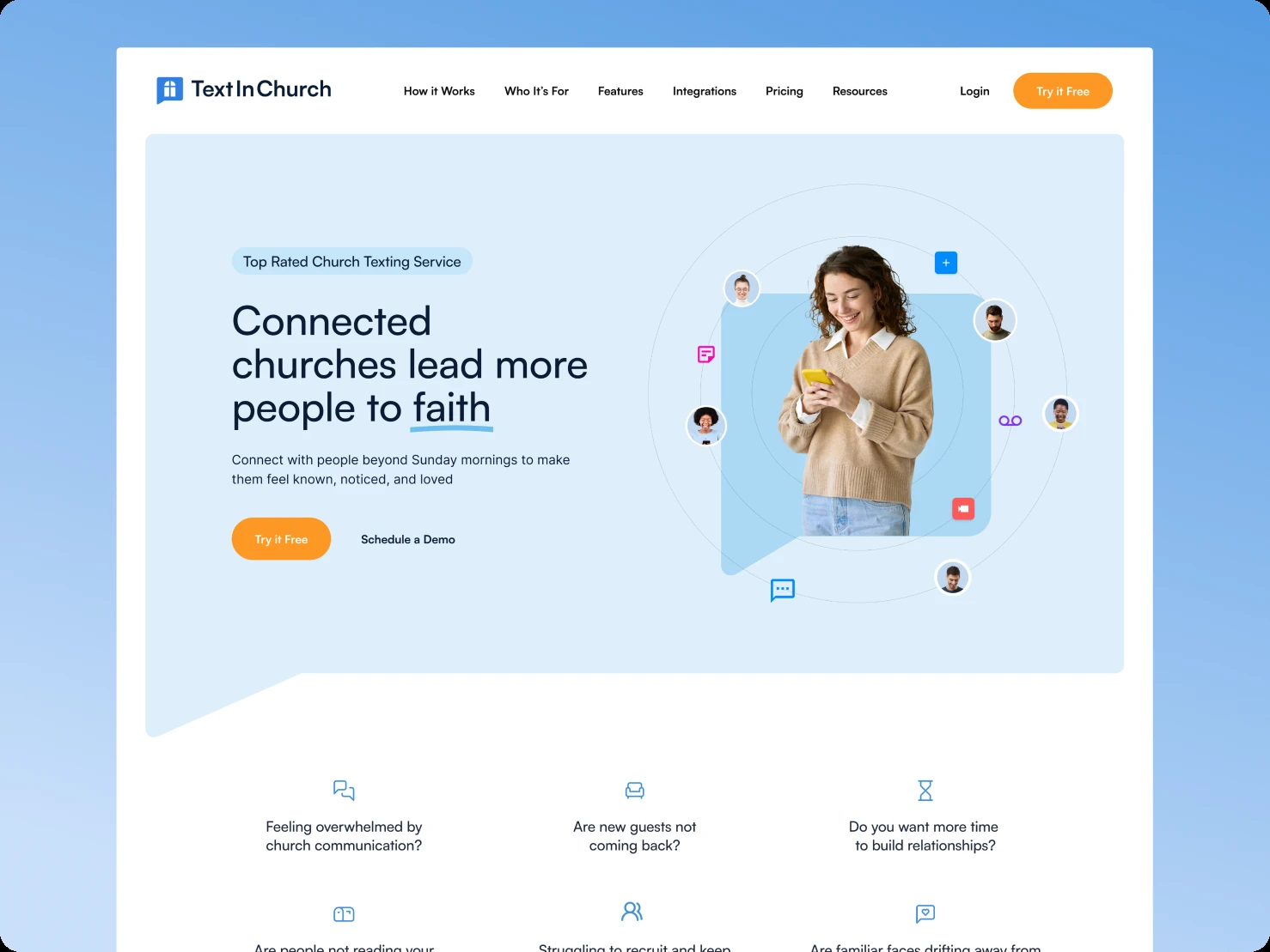
While we rebuilt the product foundation, Text in Church's website languished.
It was outdated, visually disconnected from the platform, and structurally insufficient for their marketing team's strategies. They had great campaigns planned but needed pages built fast. The website had become a bottleneck.
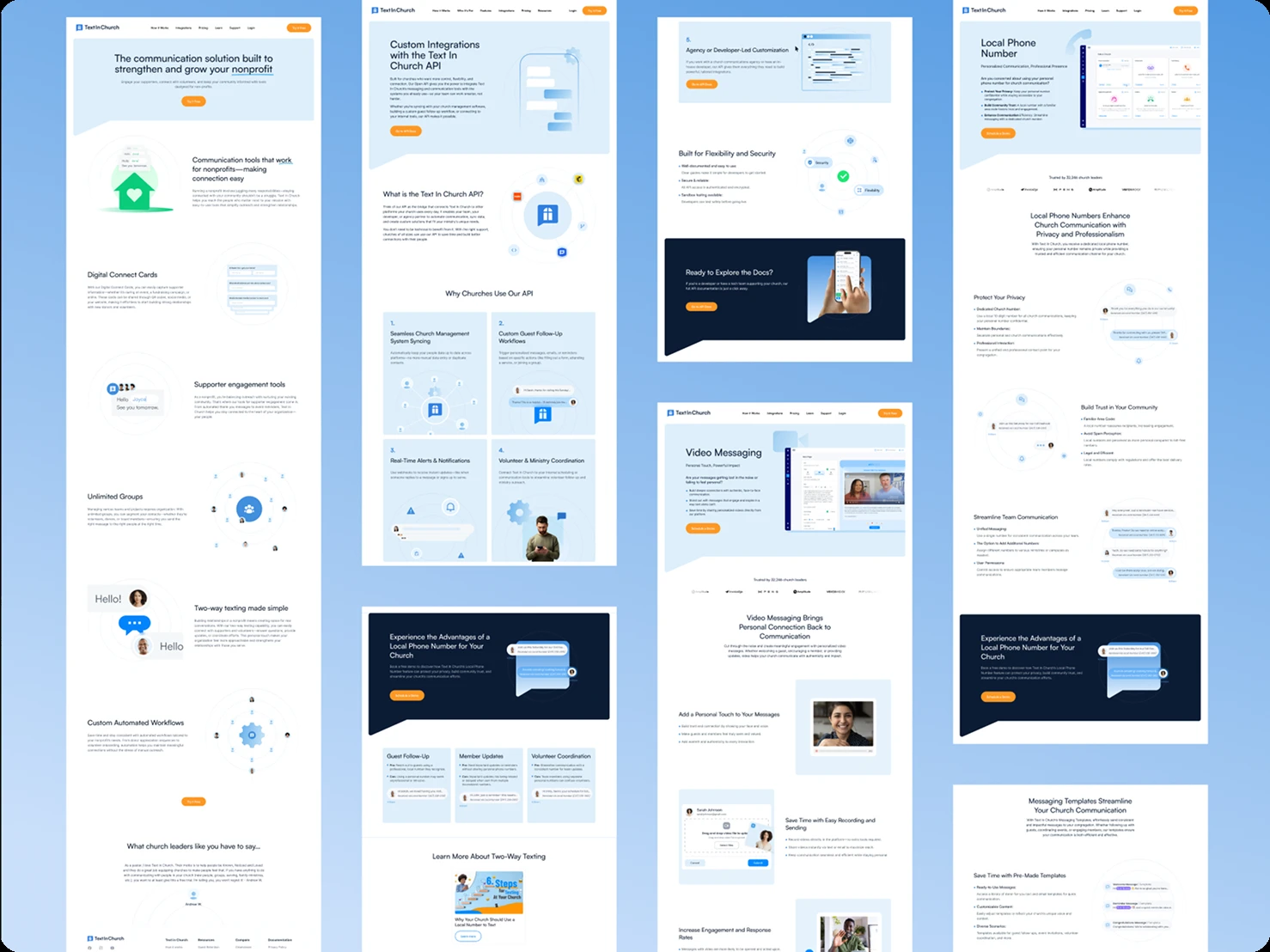
We approached website redesign differently than the product work. Instead of one massive project, we implemented a batching system. Marketing would define rounds of page groups based on campaign priorities. We'd design and build that batch. Ship it. Then move to the next batch.
This agile approach meant marketing could execute strategies without waiting months for a complete website overhaul. It also kept design work focused—solving specific problems for specific pages instead of trying to perfect everything simultaneously.
The visual direction leaned into Text in Church's brand personality: warm, welcoming, human. Typography choices felt friendly, not corporate. Color usage was vibrant without being childish. Layouts guided visitors naturally toward conversion points using hierarchy and whitespace, not aggressive pop-ups or pressure tactics.
Technically, we built in Webflow from Figma designs. Page speed optimization ensured fast loads even with rich media. Responsive design adapted layouts intelligently across devices—critical since many church staff research solutions on mobile during planning meetings.
The CMS implementation gave marketing complete autonomy for content publishing. They could launch blog posts, update copy, add testimonials, and create landing pages without design or development intervention.
The new website finally matched the product's quality and supported marketing's velocity.
What it all meant
The transformation wasn't incremental improvement. It was foundational change.
Development velocity increased substantially. Designers spent less time specifying variations and more time solving new problems. Developers spent less time asking questions and more time building features. Everyone operated more efficiently because the infrastructure supported them.
User experience improved noticeably. Church staff found the platform more intuitive. Members engaged more because interactions felt smoother. The mobile experience particularly benefited from systematic design thinking.
Text in Church gained something more valuable than a prettier product: they gained operational capability. The design system, organized workflows, and clear processes created a scalable foundation for years of future innovation without accumulating new debt.
This project proved that design operations matter as much as design outcomes. Beautiful screens built on broken processes don't scale. Sustainable product development requires both solid craft and solid infrastructure.
Text in Church now has both.
Related case studies