Modernizing Microsoft 365 management for IT administrators

Enterprise software has a reputation problem. Powerful capabilities buried under dated interfaces. Complex workflows requiring expert knowledge. Features so hidden that users don't know they exist. The technology works, but accessing that power isn't intuitive.
Sapio365, Ytria's Microsoft 365 management platform, faced exactly this challenge. IT administrators relied on it for critical tasks—managing multi-tenant environments, performing bulk operations, generating custom reports, handling security configurations. The platform could do remarkable things. But the interface made those remarkable things feel difficult.
The design had fallen behind user expectations. Features were scattered. Navigation patterns were inconsistent. Onboarding didn't explain capabilities clearly. Licensed versus unlicensed states created confusion. PowerShell dependency remained high when it should have been optional.
Visual design felt disconnected from the Microsoft ecosystem. IT admins work in Microsoft 365 daily. They understand Fluent Design patterns intuitively. Sapio365's interface didn't speak that visual language, creating cognitive friction every time users switched contexts.
Ytria needed a complete redesign that could modernize the platform without sacrificing the depth IT professionals required. They needed enterprise power with consumer-grade usability.
Understanding IT admin workflows and priorities
IT administrators juggle impossible demands. They manage hundreds or thousands of user accounts across multiple organizations. They troubleshoot access issues while maintaining security policies. They generate compliance reports while optimizing licenses. They automate repetitive tasks while responding to urgent tickets.
Their relationship with management tools is pragmatic. The tool that helps them work faster and more accurately wins. The tool that creates friction gets abandoned for PowerShell scripts and manual processes.
Through research and collaboration with Ytria's team, several patterns emerged:
Multi-tenant management is constant. IT admins frequently switch between organizations, checking user provisioning in one tenant, reviewing security policies in another, generating reports for a third. Session management needs to be effortless, not an exercise in clicking through menus.
Automation saves careers. Tasks that can be automated should be automated. But automation tools must be accessible to admins who aren't developers. If creating a job requires scripting expertise, most admins won't use it.
Context matters more than features. IT admins don't navigate software by exploring. They arrive with specific tasks: "Check this user's group memberships," "Generate a license usage report," "Bulk update these security settings." The interface needs to support task-oriented workflows, not feature-oriented exploration.
Familiarity reduces friction. IT admins already know Microsoft's Fluent Design patterns from daily work in Teams, SharePoint, Azure Portal. Interfaces that follow those patterns feel immediately comfortable. Interfaces that don't require relearning.
These insights shaped the entire redesign strategy.
Building on familiar foundations
Sapio365 is a Windows-native application optimized for handling massive datasets. We preserved that technical strength while completely modernizing the interface using web technologies and Microsoft's Fluent Design system.
This wasn't about following trends. It was strategic alignment with user mental models. When navigation patterns, visual hierarchy, and interaction behaviors match what admins already know from Microsoft 365, the learning curve disappears. Features that felt hidden become discoverable. Complex operations feel manageable.
The Fluent Design integration also accelerated development. Instead of designing and building every component from scratch, we leveraged established patterns with proven usability. This let us focus design energy on Sapio365-specific workflows rather than reinventing buttons and menus.
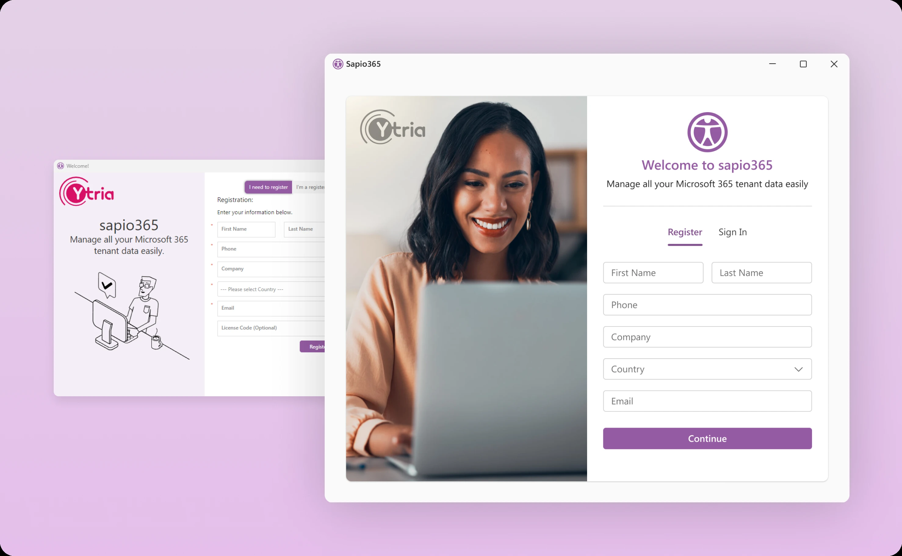
Clarifying capabilities from the first moment
Onboarding revealed a critical usability issue. Users who opened the application without activating their license saw a home screen that didn't clearly communicate feature limitations. They'd try to access capabilities, hit restrictions, and feel frustrated without understanding why.
We redesigned the home screen to make license status and available features immediately transparent. All features are visible at login, with clear indicators showing what's accessible with current licensing and what requires upgrades.
The onboarding flow itself became more engaging and informative. Instead of dumping users into the interface with minimal guidance, the redesigned experience introduces capabilities progressively, showing admins what Sapio365 can do and how to access key features.
New users now get started faster and with better understanding of the platform's value.
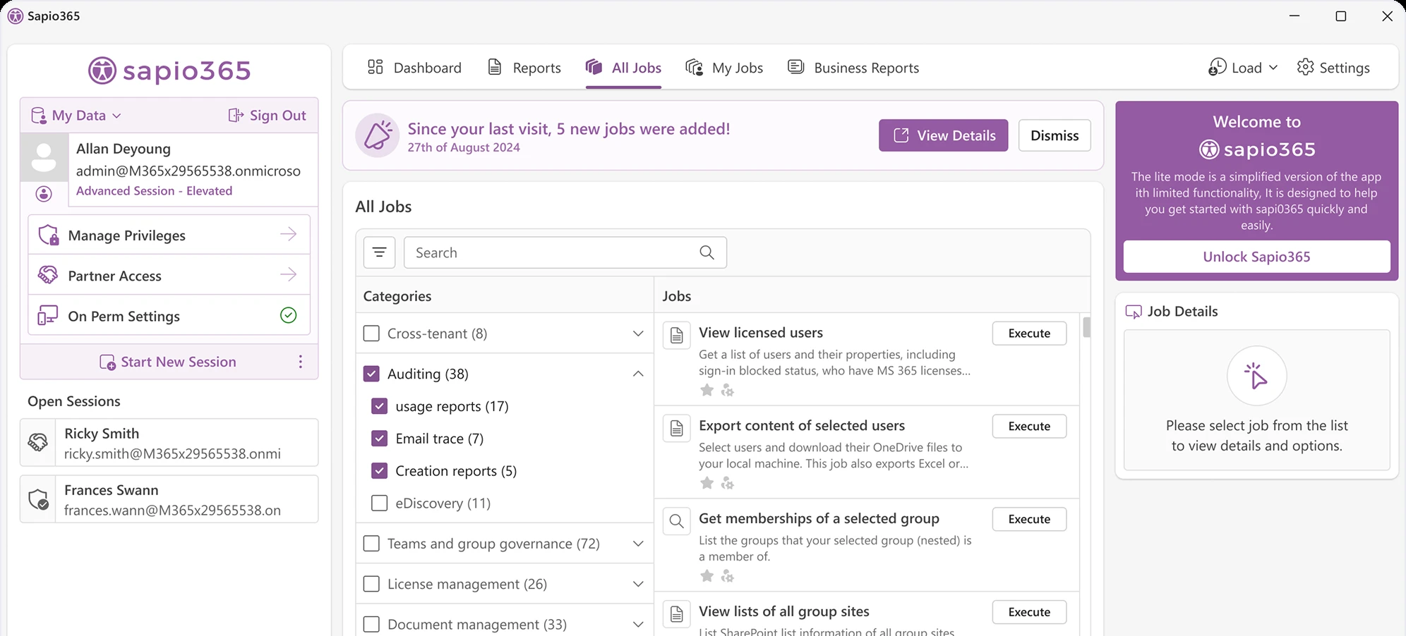
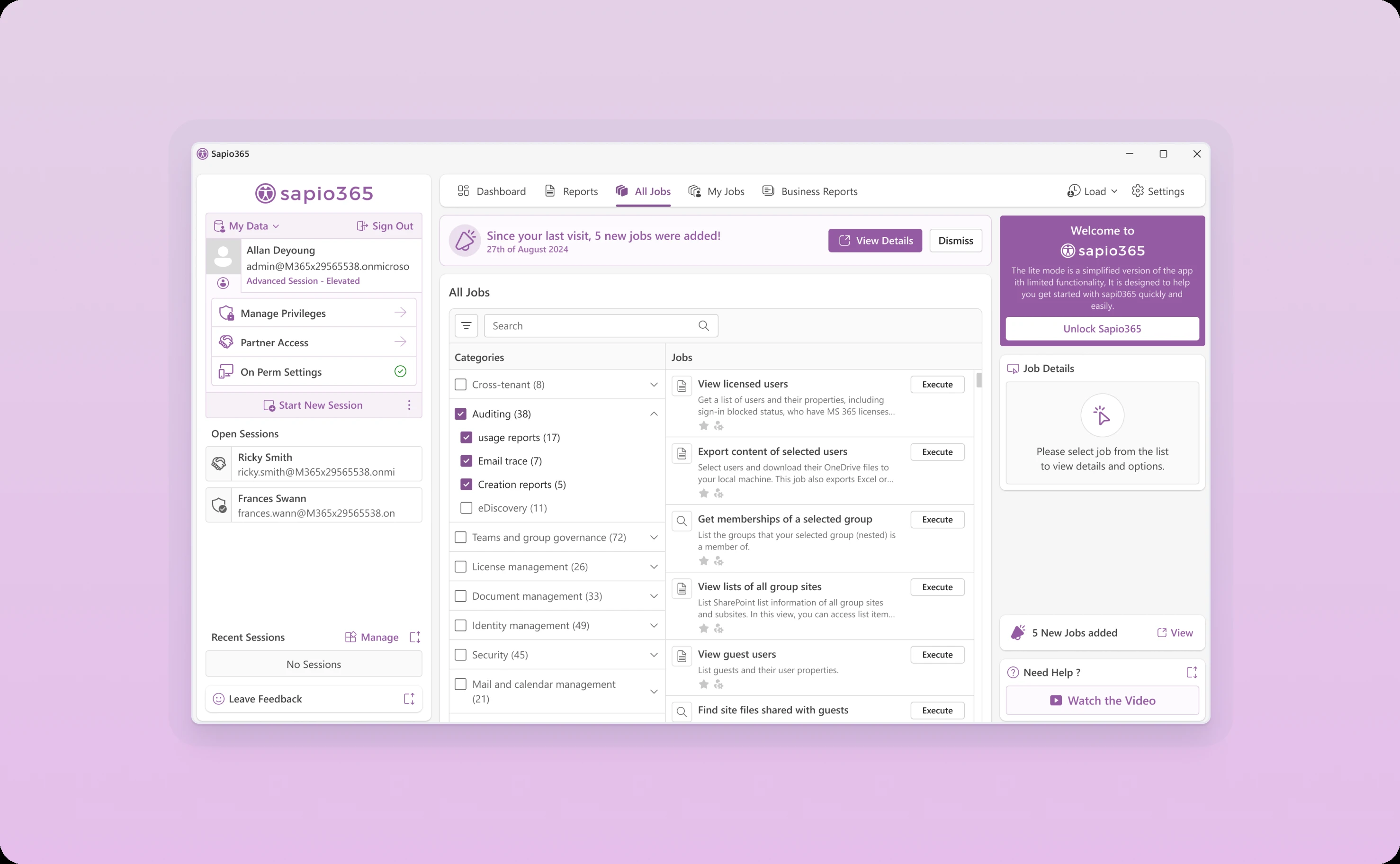
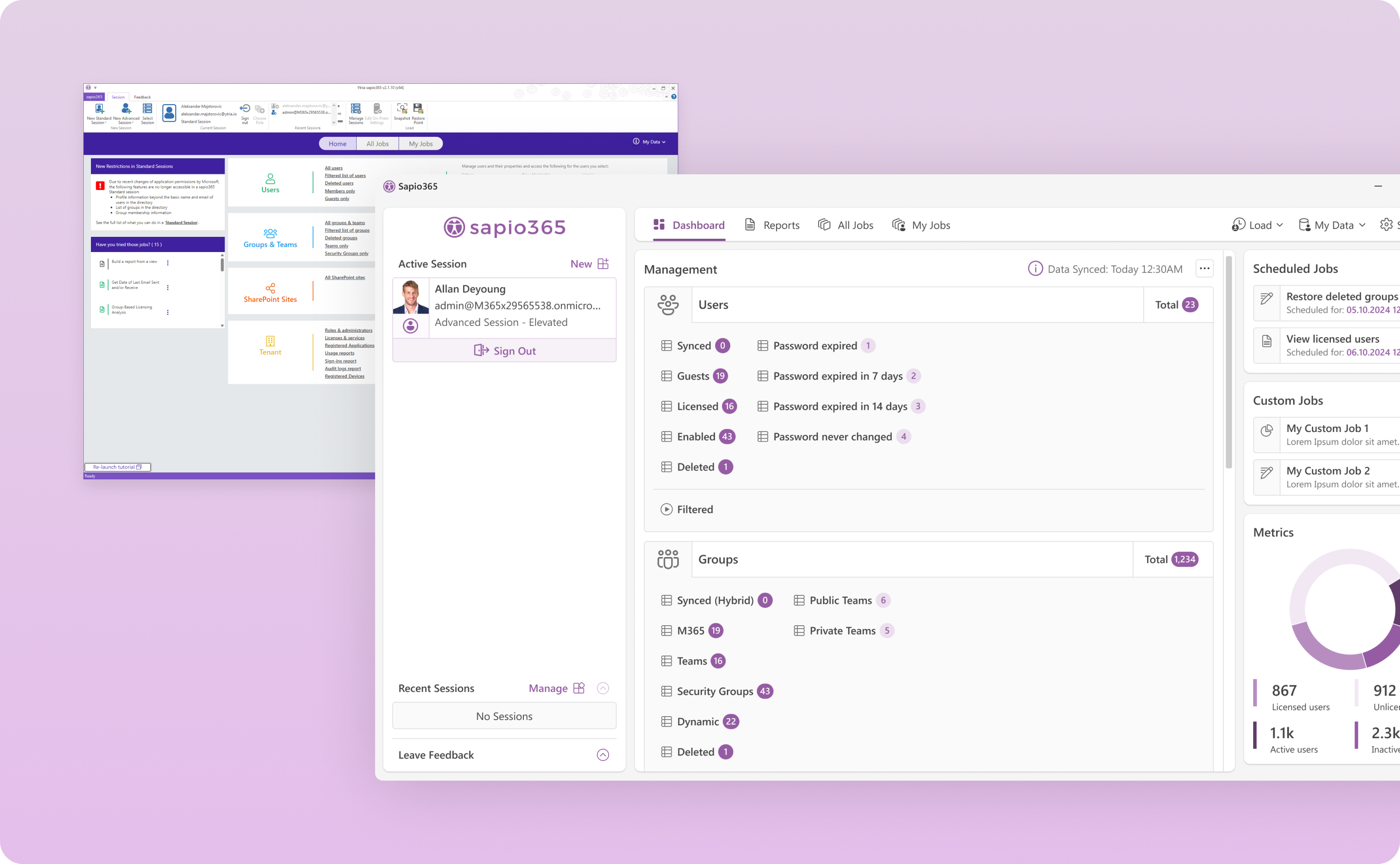
Reorganizing session management for multi-tenant workflows
IT admins managing multiple Microsoft 365 tenants need to switch contexts constantly. The original session management lived in a cluttered top navigation bar that made tracking active, open, and recent sessions difficult.
We moved session management to a dedicated left sidebar with clear visual hierarchy:
Active sessions appear at the top with immediate access to session-specific actions. Admins can see which tenant they're currently working in without hunting.
Open sessions display below active ones, making switching between organizations a single click. No menus to navigate. No context to lose.
Recent sessions live in an expandable section, providing quick access to frequently used tenants without cluttering the primary interface.
This reorganization transformed session management from a friction point into an efficiency enabler. Admins spend less time navigating and more time working.
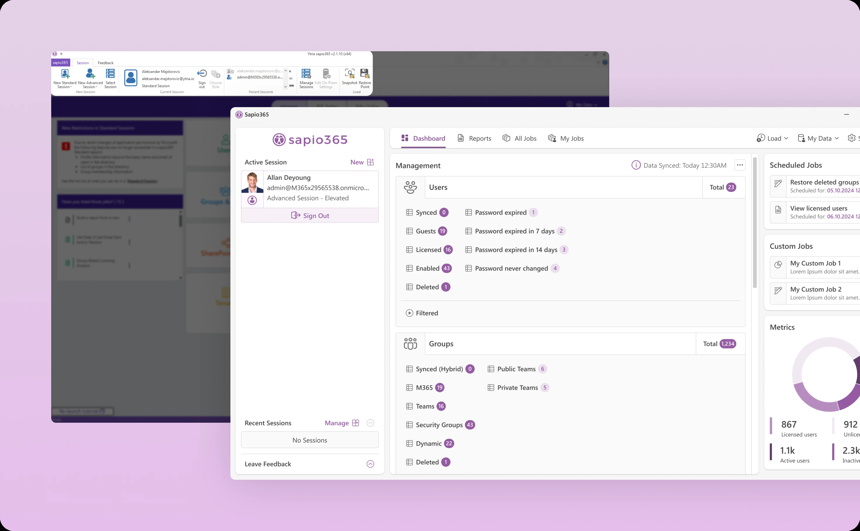
Designing a dashboard that informs and enables
The dashboard is the command center—the first place admins land after onboarding and the central hub for daily work.
We rebuilt it around personalization and quick access to critical information.
Licensed users see immediate data access through quick shortcuts. Need to check user provisioning? One click. Review security policies? Another click. The most common tasks are always within reach.
Numerical counters provide at-a-glance insights into key metrics: total users, active licenses, pending issues, scheduled jobs. Admins can assess their environment's status in seconds.
A new right-side panel houses essential tools: job schedules, custom automation scripts, and key metrics. This persistent panel keeps important information accessible without requiring navigation away from current work.
The dashboard adapts to license status, showing different capabilities based on user permissions. This prevents confusion and clearly communicates value available at different license tiers.
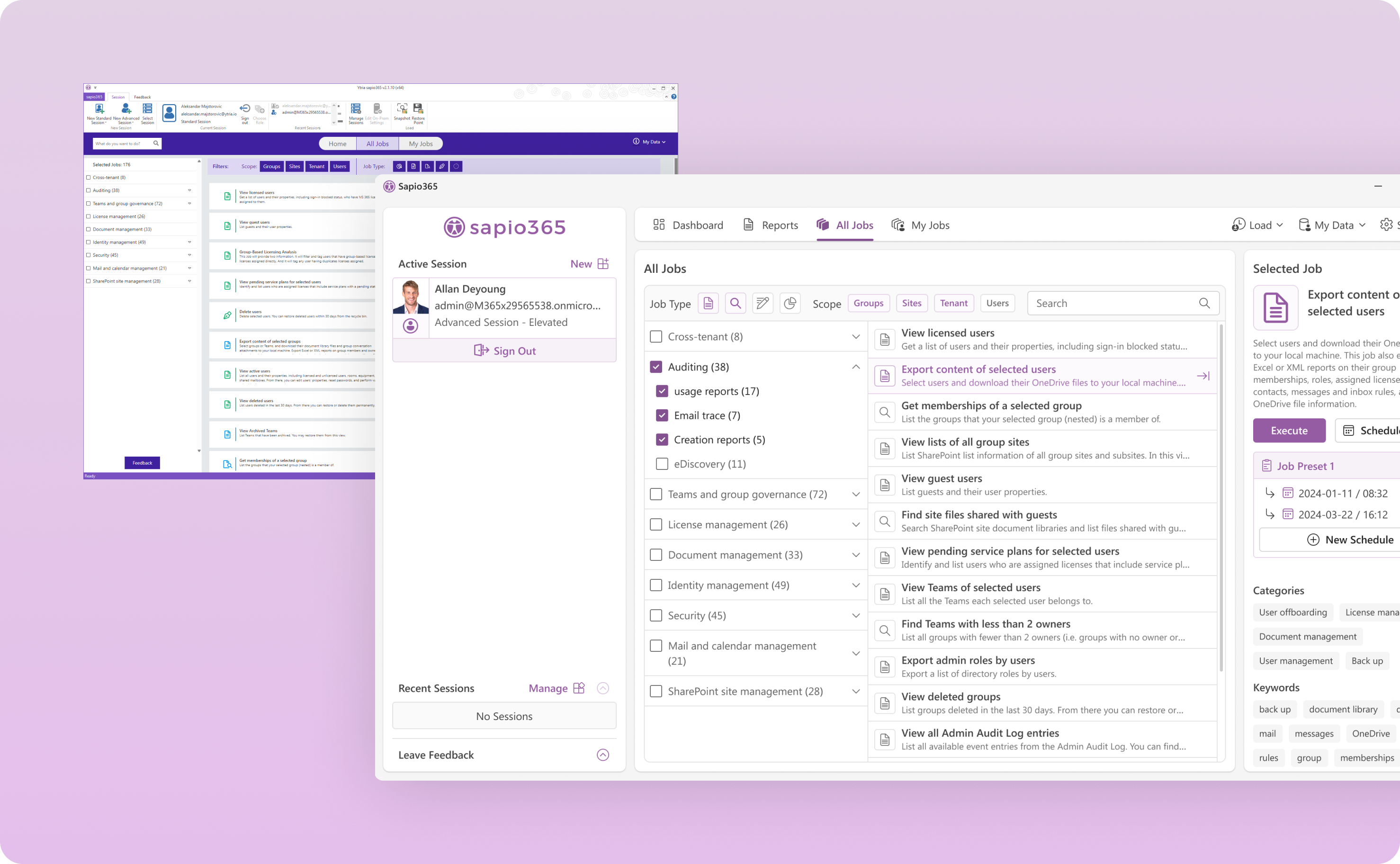
Making automation accessible through job design
Sapio365's jobs feature handles complex data operations through simple shell scripts. This is powerful, admins can automate sophisticated tasks without deep programming knowledge. But the original interface made job creation and management feel more complex than necessary.
We completely revamped the job interface around discoverability and ease of use.
Navigation, search, and filtering improvements help admins find existing jobs quickly. Instead of scrolling through long lists, admins can filter by type, search by name, or browse by category.
A dedicated right-side panel shows job details and scheduling options. Click a job, see its configuration and history immediately. Schedule execution without opening separate dialogs.
Favorites and customization features let admins build personal libraries of frequently used operations. Common tasks become one-click automations.
The redesign transforms jobs from a power-user feature into an accessible tool that all IT admins can leverage, significantly expanding adoption of automation capabilities.
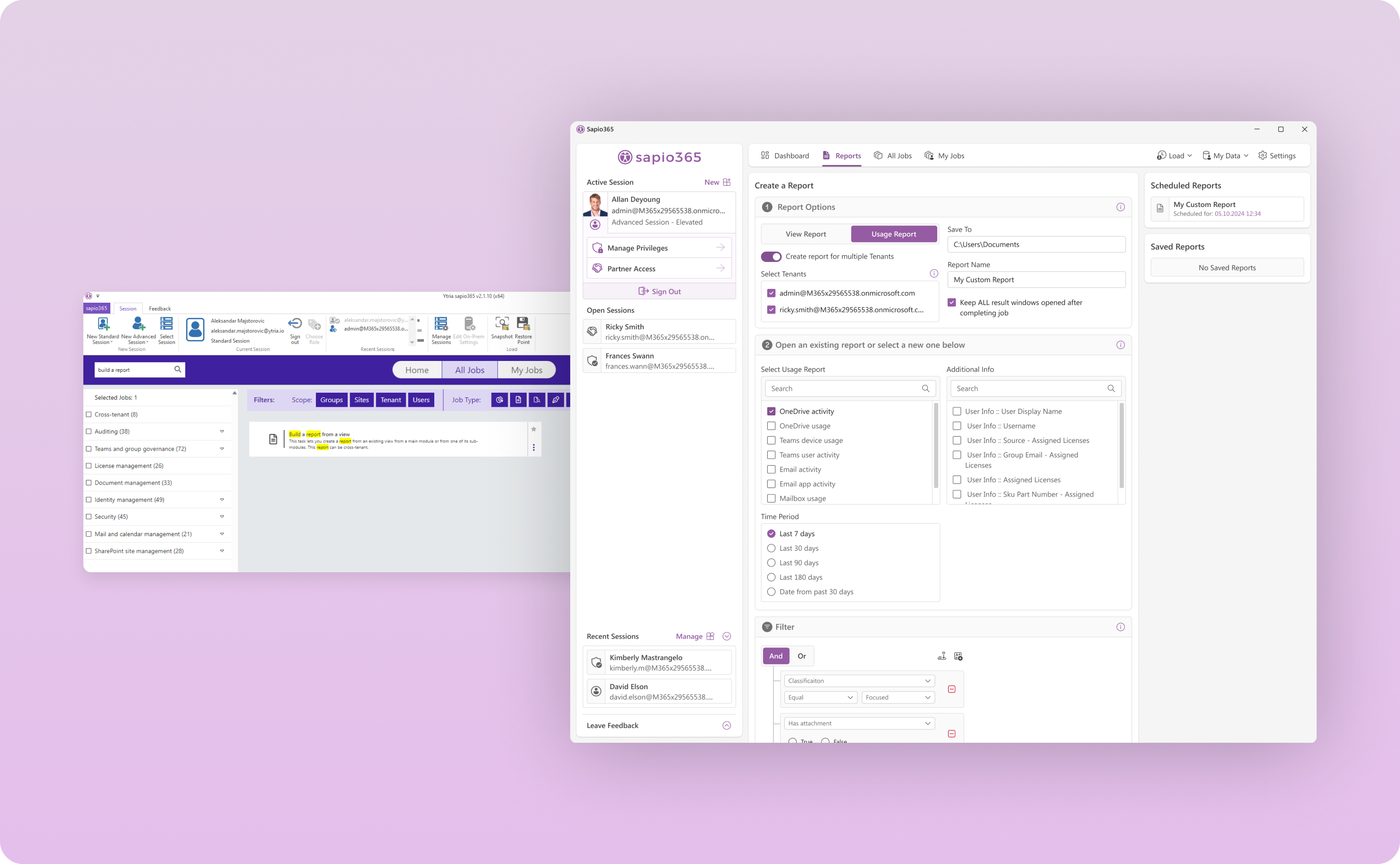
Elevating report generation from buried to accessible
Report generation is critical for compliance, auditing, and strategic planning. Yet in the original interface, creating reports required navigating through extensive job listings or searching by exact name. This friction meant a powerful feature remained underutilized.
We gave report generation its own dedicated space within the interface.
Admins can now access report creation directly without drilling through job lists. The new interface guides users through report configuration: select data sources, choose metrics, define filters, customize formatting. The experience feels like building a report, not executing a script.
This transformation turned an underused feature into a highly accessible tool. Report generation adoption increased significantly after the redesign.
Refining data presentation for better decision-making
Raw data is useless without clear presentation. Sapio365 handles enormous datasets, thousands of users, hundreds of groups, complex permission structures. Making sense of that data requires excellent information design.
We revamped the data grid with focus on clarity and actionability.
Job scoping became more transparent. When admins perform actions, the interface clearly shows whether operations affect all records or just selected entries. This prevents accidentally bulk-modifying entire datasets when targeting specific records.
Data views gained better grouping and visibility controls. Admins can organize information by relevant dimensions, department, license type, creation date, last activity. Columns can be shown or hidden based on current needs.
Visual hierarchy guides attention to important information. Status indicators, alerts, and action items stand out. Supporting details remain accessible without competing for attention.
The redesigned data grid helps admins make sense of complexity quickly and take action confidently.

What the redesign accomplished
The transformation delivered measurable improvements across all key metrics.
Usability increased significantly. IT admins report completing tasks faster with fewer errors. Navigation that previously required multiple clicks now happens in one. Features that were hidden became discoverable.
Adoption and retention improved. The modernized interface reduced training requirements. New admins could become productive faster. Experienced users found more value in features they hadn't used before.
User satisfaction rose noticeably. Feedback highlighted the intuitive design, familiar patterns, and reduced friction. The platform finally felt like a natural extension of the Microsoft 365 environment admins work in daily.
Being able to work directly with the UX designer was important for us. There was no project manager between us and the person. So the UX designer was directly connected to us, and that was very important for us.Eric Eric Houvenaghel, Founder at Sapio365
Ytria's market position strengthened as Sapio365 differentiated itself not just through capabilities but through genuine usability. In enterprise software, where features reach parity quickly, superior UX becomes the competitive advantage.
The broader lesson
This project demonstrates that enterprise software doesn't need to sacrifice power for usability. Sophisticated capabilities can coexist with intuitive interfaces when design prioritizes user workflows over technical architecture.
The strategic use of Fluent Design patterns proved that familiarity accelerates adoption. When users already understand interaction models from other tools, they can focus on tasks rather than learning the interface.
Collaborative design with deep user insights surfaces blind spots that internal teams might miss. User testing revealed assumptions that didn't match reality. Iterative refinement based on actual usage patterns created solutions that felt natural rather than imposed.
Sapio365 now offers enterprise power with consumer-grade usability, exactly what IT administrators needed.
Related case studies