Redesigning core workflows for business messaging

Search shouldn't require strategy. Onboarding shouldn't feel like homework. But for MessageDesk users, both experiences had become obstacles rather than enablers.
MessageDesk built a powerful business text messaging platform that helps companies communicate with customers efficiently. The features were robust. The messaging capabilities were strong. But two critical touchpoints were creating friction that slowed users down and undermined the platform's value.
Search was broken. Users couldn't find conversations, contacts, or message content quickly. The search function existed but didn't work the way people expected it to. Every failed search meant wasted time and mounting frustration.
Onboarding wasn't smooth. New users landed in the platform without clear guidance on what to do next. Critical features went undiscovered. Setup tasks remained incomplete. The first experience failed to showcase what made MessageDesk valuable.
These weren't minor annoyances. They were barriers preventing users from extracting full value from the platform. MessageDesk needed solutions that would make search intuitive and onboarding engaging.
Understanding what users actually need
We started by building on MessageDesk's existing research, diving deeper into user journeys to understand how people naturally try to find information and learn new platforms.
Search behavior patterns emerged quickly:
Users expect search to be comprehensive. They don't think in categories like "contact search" versus "message search." They type what they're looking for and expect the system to figure out where to look.
Context matters more than exact matches. People remember fragments—a customer's first name, part of a conversation topic, a date range. Search needs to work with incomplete information.
Speed determines usage. If search is slow or requires multiple attempts, users abandon it and resort to manual scrolling. Fast, accurate results build trust and encourage ongoing use.
For onboarding, the patterns were different but equally clear:
Users need immediate value. Long tutorials get skipped. Walls of text get ignored. People want to accomplish something meaningful in their first session, not just read about possibilities.
Progress needs to be visible. Setup tasks feel overwhelming when presented as a list. Breaking them into steps with clear progress indicators creates momentum.
Guidance should be contextual. Help should appear exactly when needed, not dumped upfront in a welcome modal that users close immediately.
We mapped detailed user journeys—from the moment someone opens search to the specific filters they need, from landing on the welcome screen to completing their first message. This granular understanding shaped every design decision that followed.
Building search that works like users think
The original search function was buried and limited. We rebuilt it around natural user behavior.
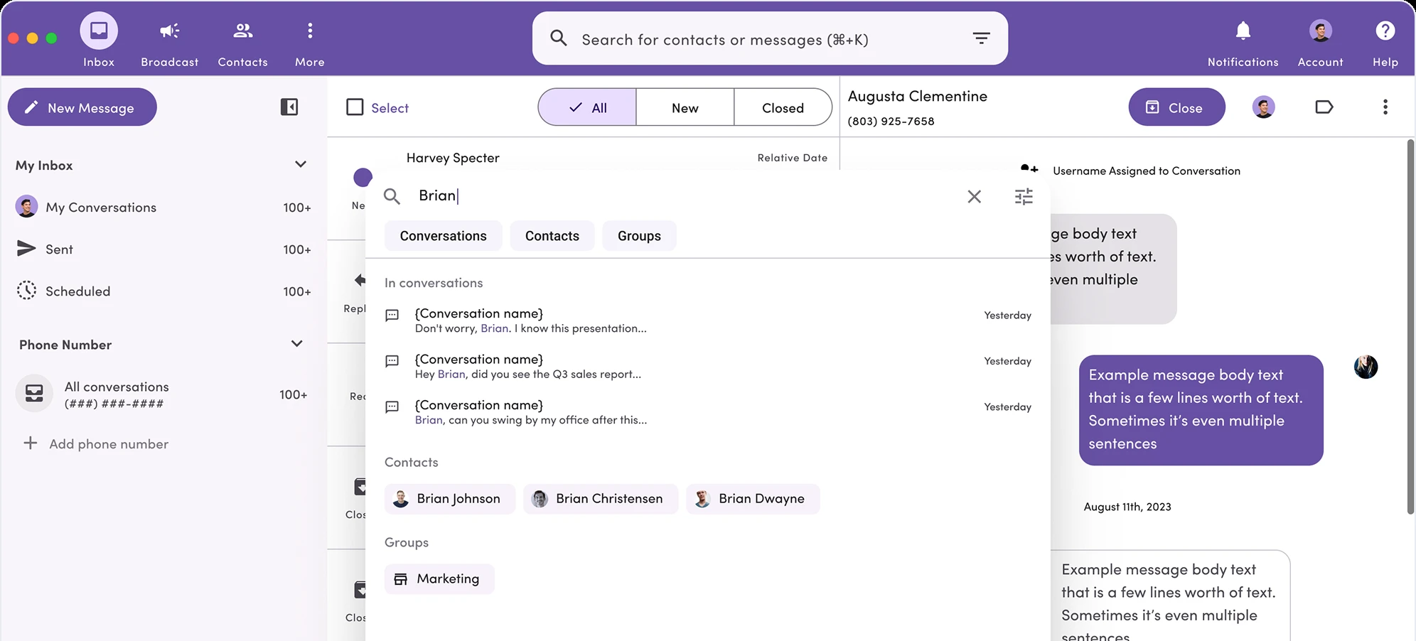
A prominently placed search bar now sits where users expect to find it, visible, accessible, always available. This isn't just about aesthetics. Visibility encourages usage. When search is easy to access, users actually use it instead of resorting to manual navigation.
Predictive suggestions appear as users type, helping refine searches before they're even completed. Looking for a customer named Jennifer? Suggestions appear after typing "Jen," showing Jennifer Rodriguez from Acme Corp and Jennifer Chen from Beta Industries. Users can select immediately instead of typing full names.
Multi-element search capabilities let users search across conversations, contacts, message content, and metadata simultaneously. Type a company name and get relevant contacts plus recent conversations with that company. Search a phone number and find the associated contact plus message history. The system understands context and delivers comprehensive results.
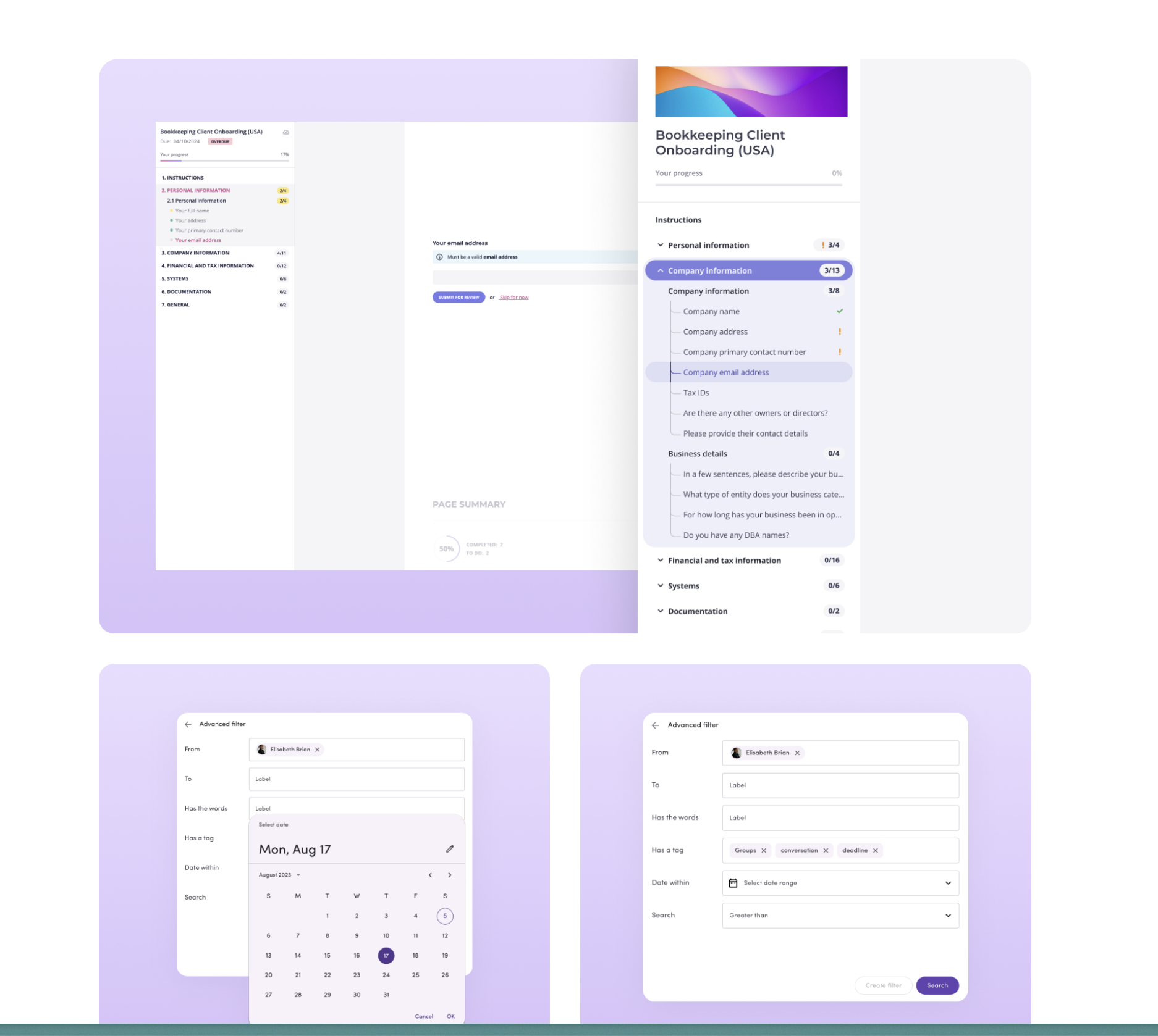
Filter options let users narrow results by date range, contact type, message status, or custom tags. This transforms search from a blunt instrument into a precision tool that adapts to different use cases.
We leveraged Material Design patterns strategically. This wasn't about taking shortcuts—it was about using familiar interaction patterns that users already understand from other tools. Familiarity reduces cognitive load and speeds up both design and development.
The search interface feels natural because it works the way users expect search to work, drawing on mental models they've built from years of using other platforms.
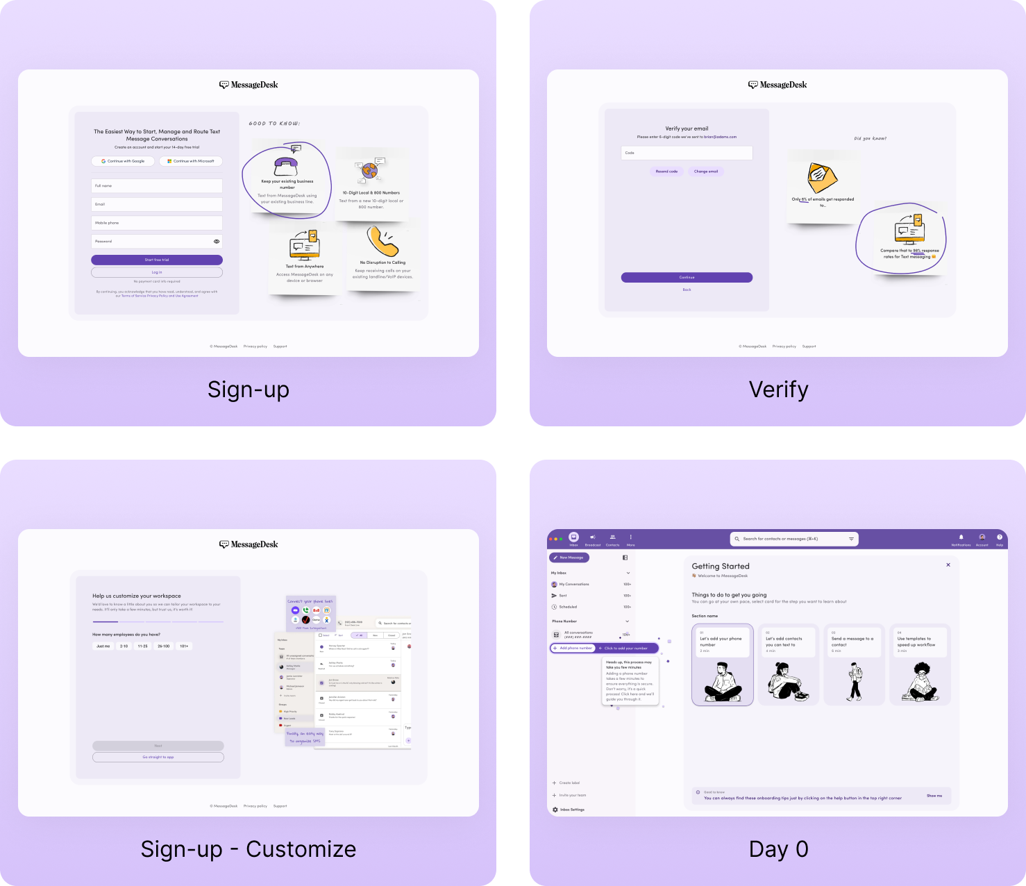
Onboarding that motivates instead of lectures
Traditional onboarding dumps information upfront: "Here are 47 features you might use someday." Users skim, click through, and forget everything immediately.
We designed gamified onboarding that transforms setup into an engaging experience.
Animated progress indicators provide instant visual feedback as users complete tasks. Add a phone number? The button animates, a checkmark appears, and progress advances. Invite a teammate? Another task completes with satisfying visual confirmation.
These aren't arbitrary animations. They serve psychological purposes: creating a sense of accomplishment, building momentum, and making abstract progress tangible. Each completed task feels like a small win, motivating users to continue.
Guided task flows break setup into digestible steps. Instead of overwhelming users with everything at once, the system presents one clear action at a time. Complete this, then move to the next. The path forward is always obvious.
Contextual explanations appear exactly when relevant. When adding a phone number, a brief tooltip explains why this matters and what it enables. When inviting teammates, guidance clarifies permission levels. Information is provided just-in-time, when users have context to understand and remember it.
The gamification isn't superficial. It's designed around behavioral psychology—giving users clear goals, visible progress, and immediate rewards for completion. Setup stops feeling like an obligation and starts feeling like an achievement.
Designing within constraints
Every project has constraints. MessageDesk's development resources and timeline required strategic thinking about efficiency.
Our use of Material Design wasn't just about familiarity—it was about development velocity. By leveraging an established design system, we provided MessageDesk's developers with pre-built components and clear implementation patterns. This significantly reduced development time without compromising user experience quality.
We prototyped each flow for testing, gathering user feedback before finalizing designs. This iterative approach surfaced usability issues early when they were cheap to fix, not late when they required expensive rework.
The collaborative process with MessageDesk's team ensured solutions aligned with their vision while incorporating our UX expertise. They provided clear direction on goals and constraints. We contributed research-backed solutions and design thinking.
"We got a 6x increase in efficiency - and we experienced that level of time savings across all our concurrent projects. It wasn't just one project that went smoothly; we could run faster as an entire organization."
Joshua Merryman, Head of Product at Message desk
What it means for users
The redesigned search experience cuts the time users spend hunting for information. Comprehensive results, predictive suggestions, and flexible filtering transform search from a frustrating guessing game into a reliable tool users trust.
The gamified onboarding increases completion rates and feature discovery. Users who complete setup are more likely to adopt advanced features, integrate MessageDesk into their workflows, and stick with the platform long-term.
These improvements address fundamental user needs: finding information quickly and learning the platform efficiently. When these core experiences work smoothly, everything else becomes easier.
The project demonstrates that impactful UX improvements don't always require reinventing everything. Sometimes the biggest wins come from fixing the fundamentals—making search work properly and onboarding feel effortless.
MessageDesk users can now find what they need and learn what they need without fighting the interface. That's what good UX should always do.
Related case studies