Improving form experiences for professional services

Nobody enjoys filling out forms. But in accounting, legal, finance, and education, collecting client information is unavoidable. The question isn't whether forms are necessary, it's whether they need to be painful.
Content Snare built their platform around a radical idea: client information collection shouldn't feel like paperwork torture. Their solution eliminates the back-and-forth emails, scattered spreadsheets, and incomplete submissions that plague professional services.
The platform was working. Businesses were using it. But there was friction in the experience.
Form validation felt reactive rather than helpful. Users would fill out entire forms only to discover errors at the end. Navigation lacked clear hierarchy, making it harder than necessary to move through multi-section forms. These weren't catastrophic failures, but they were friction points that added up across thousands of form completions.
Content Snare knew their UX could be better. They needed a design partner who understood how to make complex information gathering feel effortless.
Finding the friction points
We started with a comprehensive UX audit, mapping the complete client journey from form opening to final submission.
The patterns emerged quickly:
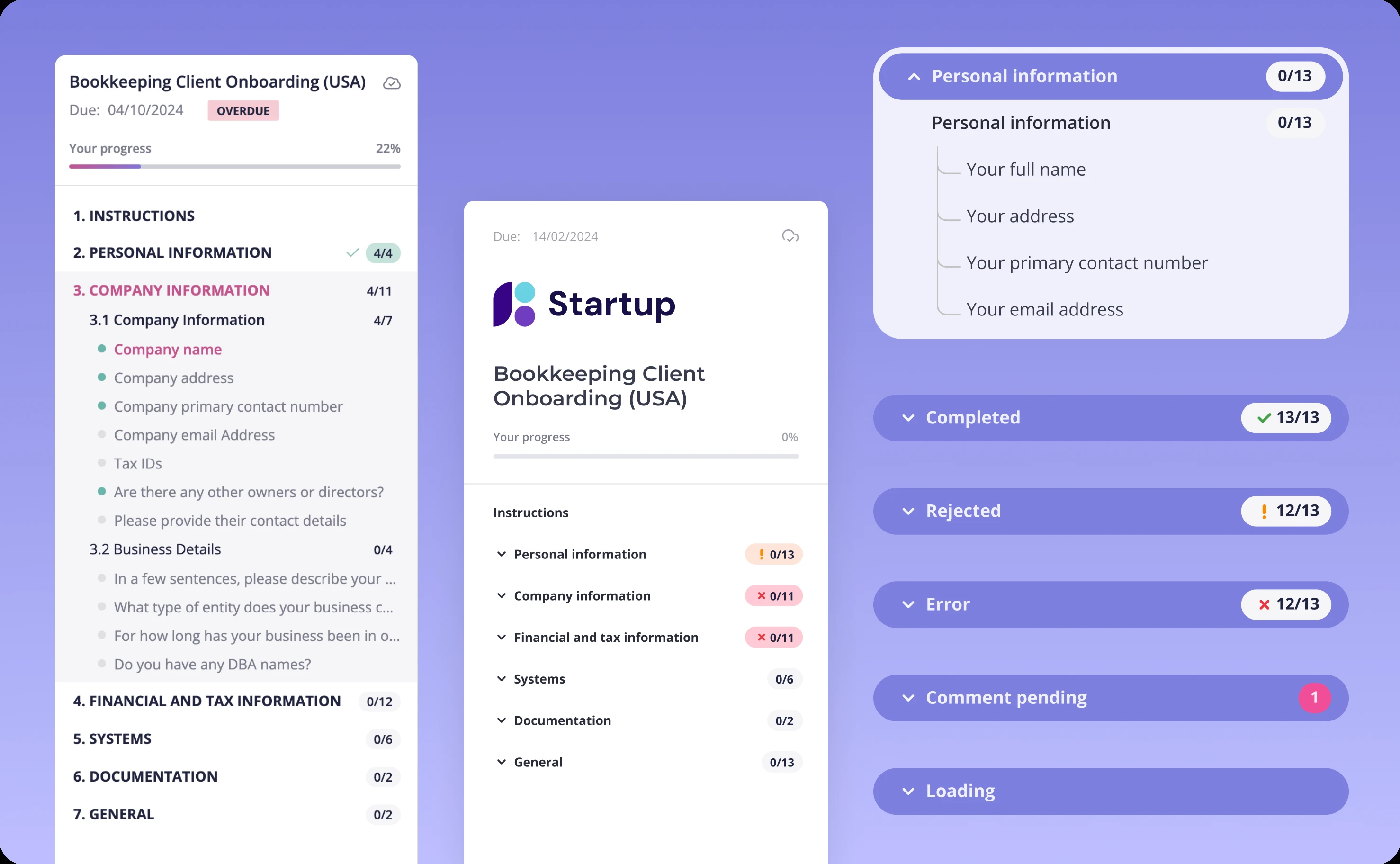
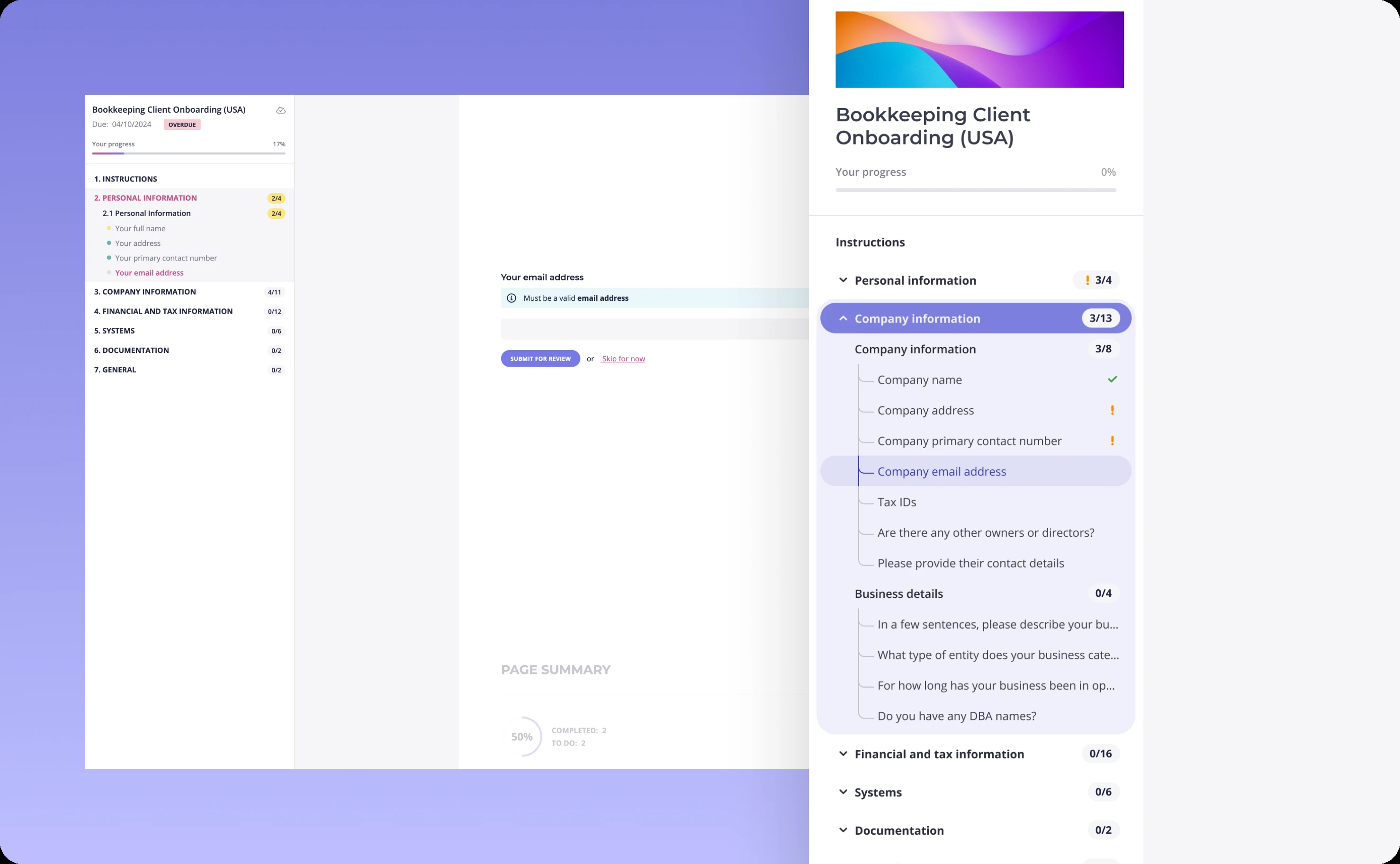
Error discovery came too late. Users filled out entire sections before learning they'd made mistakes several fields back. This forced them to scroll, search, and correct—breaking their flow and increasing frustration.
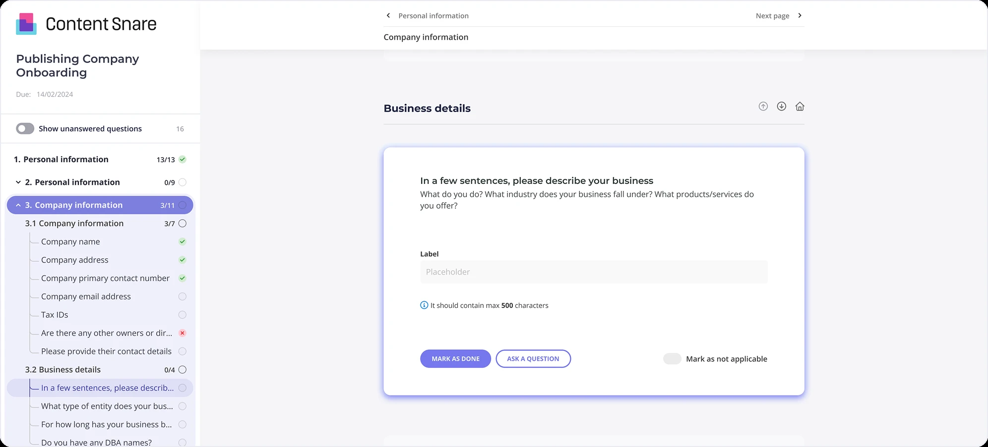
Navigation hierarchy was unclear. In forms with multiple sections, users couldn't quickly assess where they were, what they'd completed, or what still needed attention. The side navigation existed but didn't communicate status effectively.
Validation feedback lacked context. When errors occurred, messages didn't always make it clear what needed fixing or why the input failed validation.
These weren't abstract UX problems. They were real barriers causing real delays in Content Snare's clients' workflows. Every confused user was a delayed project for an accounting firm, law office, or educational institution.
We worked closely with Content Snare's team to prioritize improvements, focusing on areas where small design changes could create disproportionate value.
Smarter error handling that guides instead of blocks
The original validation approach waited until users tried to submit before revealing problems. This created a frustrating treasure hunt: where's the error? What's wrong with it? How do I fix it?
We rebuilt error handling around proactive guidance.
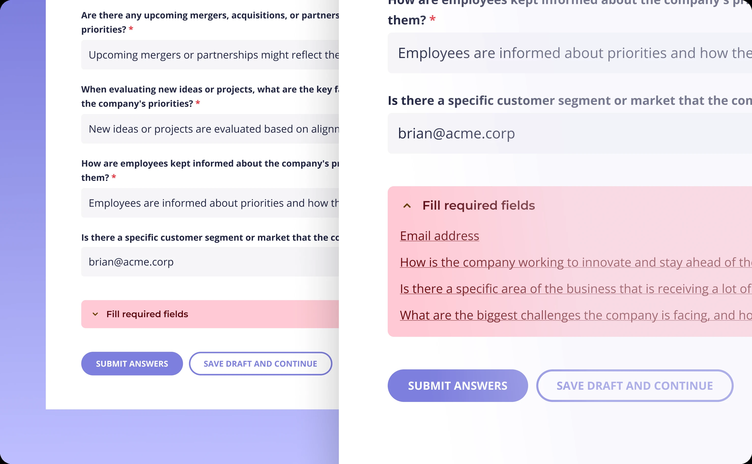
Inline messages now provide instant feedback the moment a user leaves a field. Invalid email format? You know immediately, while you're still in that section, with clear guidance on what's expected. Required field left empty? The message appears right there, not buried in a final error summary.
But inline messages alone aren't enough for long forms with dozens of fields. Users still need a way to understand all issues at once and navigate to them efficiently.
That's why we added a smart alert banner that appears above the submit button. When validation fails, the banner doesn't just say "fix errors"—it provides direct links to each problem field. Click a link, jump straight to that field, fix it, move on. No scrolling, no searching, no frustration.
This two-layer approach combines immediate, contextual feedback with efficient error resolution. Users catch most problems in real-time and can quickly resolve anything they miss.
Navigation that tells you where you are
Multi-section forms present a fundamental UX challenge: how do you help users maintain orientation while moving through potentially dozens of fields across multiple categories?
The original side navigation showed sections but didn't communicate progress, status, or hierarchy effectively. Users could see sections existed but couldn't quickly assess completion state or prioritize what needed attention.
We refined the navigation using strategic color patterns and visual hierarchy.
Completed sections, active sections, and incomplete sections now have distinct visual states. Users can glance at the navigation and immediately understand their progress. The color system creates intuitive meaning without requiring explanation.
Visual hierarchy guides attention naturally. Required sections stand out from optional ones. Active fields are clearly distinguished from inactive ones. The design creates a roadmap that users can follow without thinking about it.
Importantly, we preserved Content Snare's client customization options. The navigation system works within their brand customization framework, allowing businesses to maintain their identity while benefiting from improved usability.
The result is navigation that doesn't just list sections—it tells a story about progress, priorities, and what comes next.
Working within the system
All improvements were developed within Content Snare's existing design system. This wasn't about introducing visual disruption. It was about refining patterns to work harder for users.
We iterated based on user testing and feedback, adjusting validation timing, message clarity, color contrast, and navigation states until the experience felt seamless. The process was collaborative and iterative, with Content Snare's team providing insights from their deep understanding of customer workflows.
"I definitely recommend Tenscope. It's been really nice working with the team simply because we finally found a designer that we like working with. We love their designs."
James Rose, CEO at Content Snare
What changed
The improvements weren't about dramatic visual overhauls. They were about removing friction at critical moments.
Form completion times decreased as users caught and fixed errors in real-time instead of at the end. Navigation clarity helped users maintain momentum through long forms without losing their place. Validation feedback became guidance rather than punishment.
Content Snare's clients—the accounting firms, legal practices, educational institutions—could collect information faster with fewer incomplete submissions and less back-and-forth with their own clients.
This project exemplifies a core UX principle: the best improvements are often invisible. Users don't notice great error handling or intuitive navigation because it just works. They simply complete their tasks faster and with less frustration.
That's exactly what Content Snare needed.
Related case studies