Redesigning healthcare tech for caregivers who can't afford to wait

Senior living facilities run on care, but too often, caregivers spend more time fighting their software than helping residents. Staff juggle complex workflows, hunt for critical information across disconnected screens, and waste precious minutes on tasks that should take seconds.
Fynn wanted to change that. They built a modern healthcare management platform designed to streamline operations and improve resident care. But having the right mission isn't the same as having the right experience.
Their caregivers were drowning in manual processes. Updating Activities of Daily Living (ADLs) meant clicking through resident after resident, one at a time. Finding critical health information required navigating multiple screens. Simple tasks took too long, and errors crept in when staff rushed to keep up.
For Fynn to deliver on their promise of operational efficiency, they needed a UX that actually made caregivers' lives easier.
That's when they partnered with Tenscope.
Understanding the real workflow
We didn't start with features. We started with people.
Through in-depth user research, we shadowed caregivers during their shifts, watched how they moved through the platform, and listened to their frustrations. The patterns were clear:
Time was the enemy. Caregivers managed 20-30 residents per shift. Every extra click, every redundant screen, every piece of buried information added up to hours of lost productivity.
Context was scattered. Critical details about a resident's health status, dietary needs, or discharge plans lived in different places. Staff had to remember where to look, or worse, miss something important.
Bulk tasks were impossible. When multiple residents needed the same type of care update, there was no efficient way to handle it. Caregivers clicked through the same flow dozens of times per shift.
These weren't minor annoyances. They were structural problems that prevented Fynn's platform from delivering real value. So we focused on the two areas that would transform daily workflows: how caregivers view resident information, and how they manage ADLs at scale.

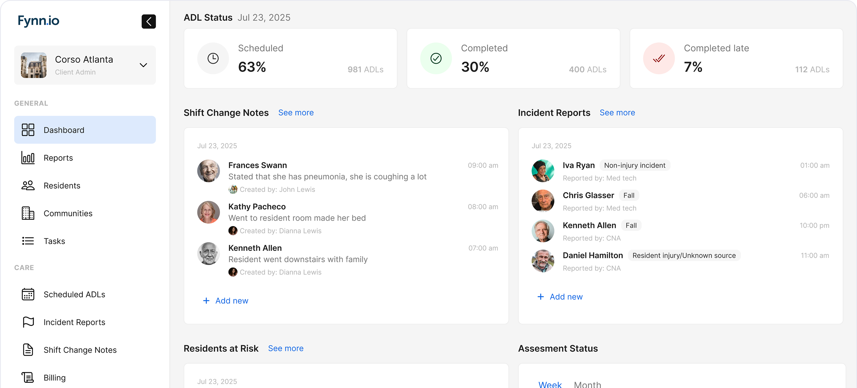
Resident profiles that actually work
The original resident profile was a data dump. Information existed, but it wasn't organized around how caregivers actually think or work. Finding what you needed meant scrolling, scanning, and hoping you didn't miss something critical.
We redesigned the profile to be a command center, not a database.
Every element was positioned based on urgency and frequency of use. Critical health concerns surfaced immediately through an At Risk Flow that flagged residents requiring immediate attention. Staff could see the issue, understand its severity, and take action without digging through logs.
Pending Discharge information moved front and center for residents transitioning out, eliminating the chaos of last-minute planning. And Temporary Warning alerts provided real-time medical updates that couldn't wait for the next shift handoff.
The new layout didn't just look cleaner. It fundamentally changed how fast caregivers could access information and respond to resident needs. Every screen was designed around the question: what does this person need to know right now?
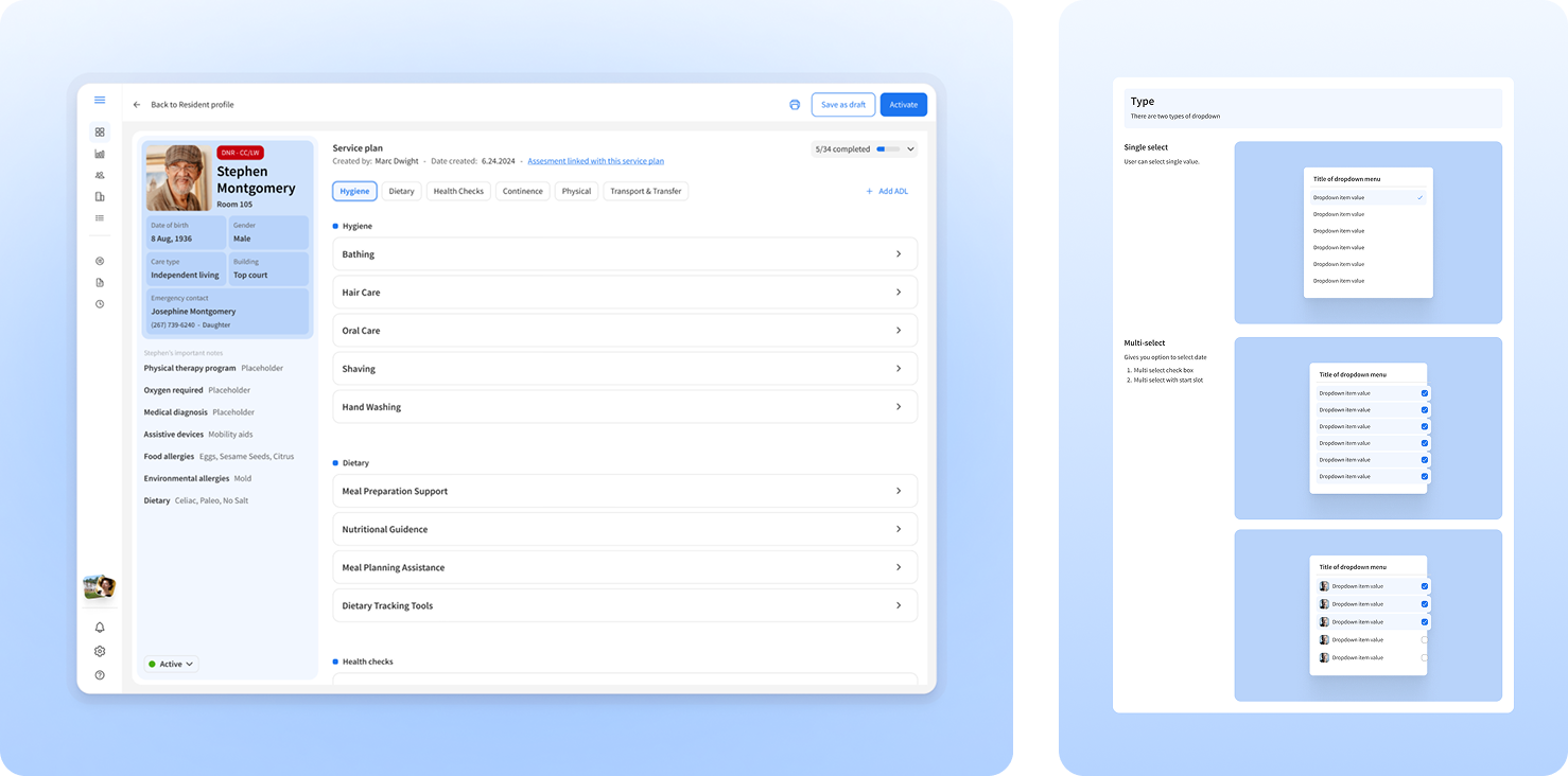
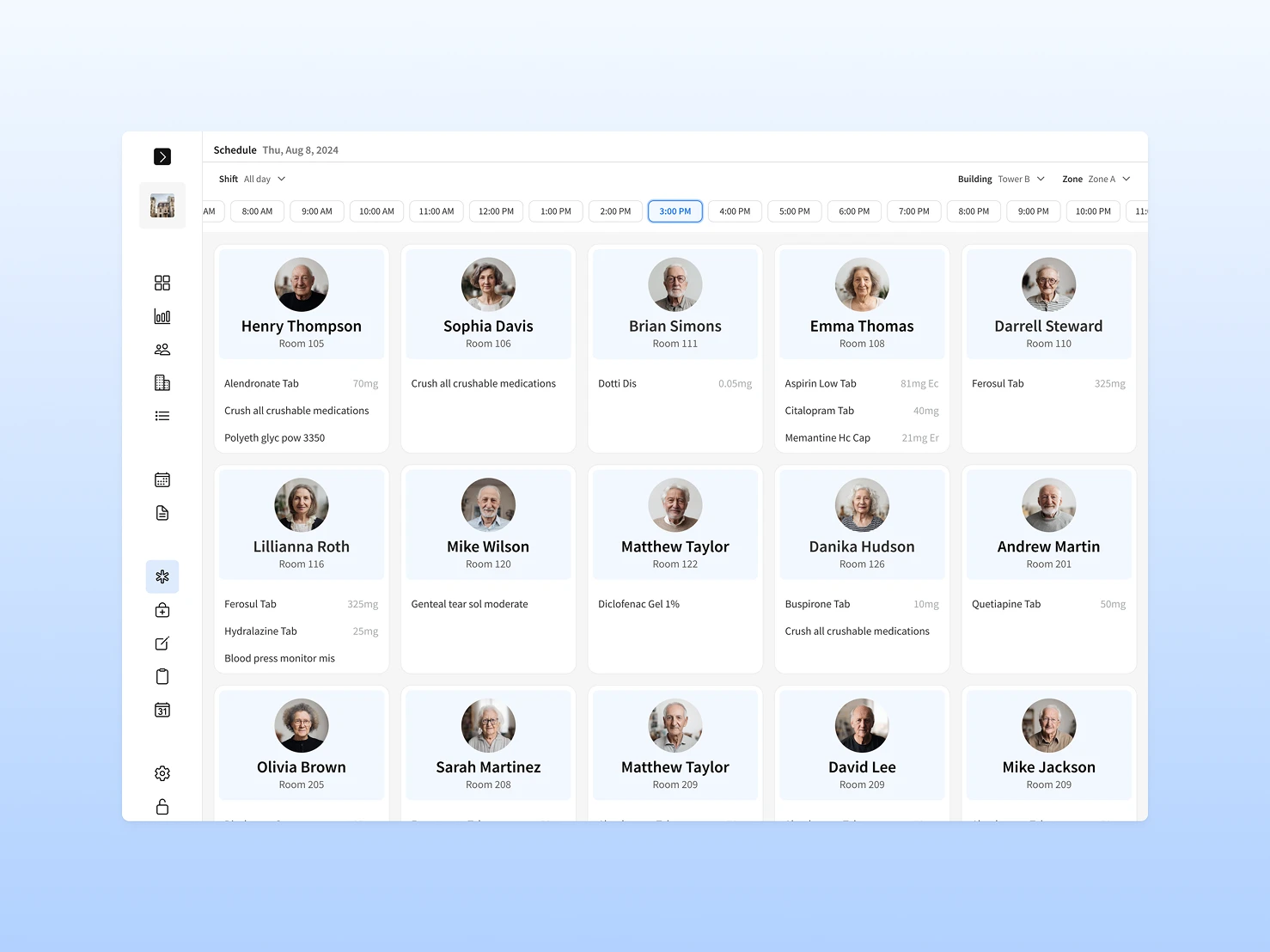
Bulk ADL management that saves hours
Managing Activities of Daily Living one resident at a time might work for a handful of people. But in facilities with dozens of residents, it's a productivity nightmare.
We built Bulk ADL Management to solve this at scale.
The new system introduced intuitive filtering by ADL type, letting caregivers focus on specific categories like dietary tracking, mobility checks, or medication management across all residents at once. No more clicking into individual profiles when the same update needed to happen for multiple people.
The At Risk flow extended into bulk management, providing visual cues and immediate details about residents needing urgent attention. Staff could prioritize care efficiently without losing track of anyone.
We added the ability to acknowledge and address temporary warnings in bulk, giving caregivers an extra layer of precision when responding to time-sensitive updates. And the interface made it simple to input and modify ADL data for multiple residents simultaneously, dramatically reducing repetition and manual errors.
The result? What used to take 30 minutes per shift now took 5. Caregivers spent less time on data entry and more time on care.
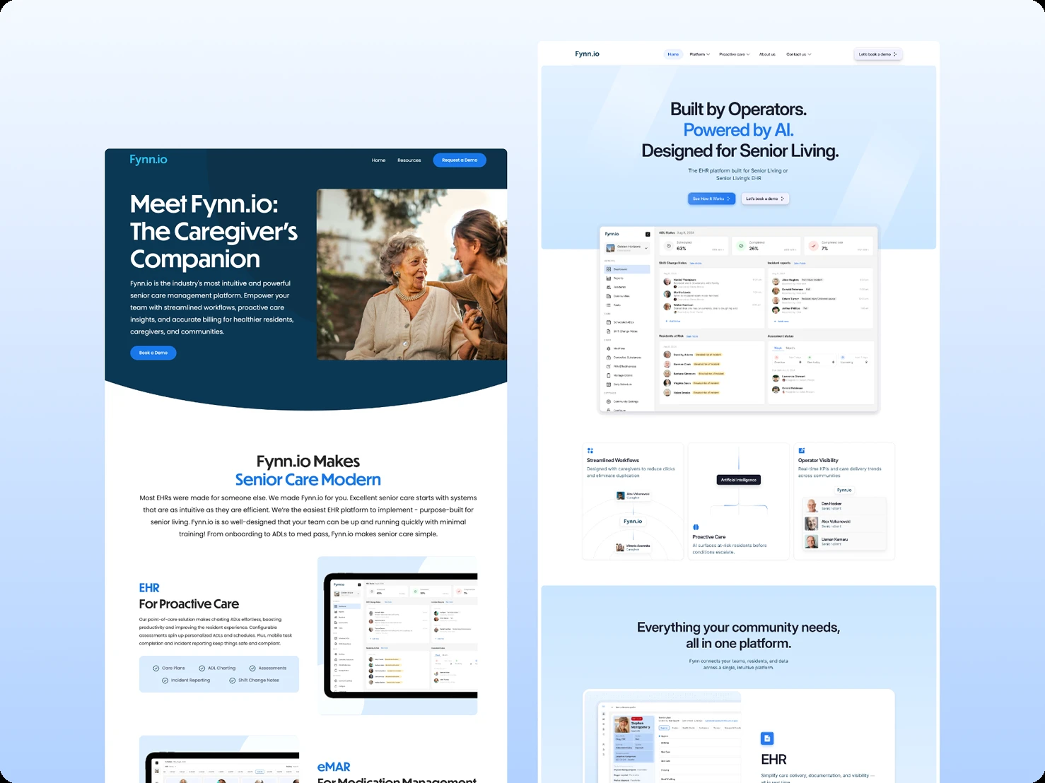
A website that converts, not just informs
Fynn's product experience was getting better, but their website wasn't keeping up. It felt dated, disconnected from the platform itself, and failed to communicate the value caregivers were actually experiencing. Potential customers landed on the site and left without understanding what made Fynn different.
The website had become a barrier to growth, not a driver of it.
We approached the redesign with a clear strategy: align the website with the product's modern aesthetic while making it bright and engaging enough to capture attention. This wasn't about over-designing or chasing trends. It was about creating a marketing presence that felt authentically healthcare-focused while converting visitors into users.
The design philosophy was simple: modern healthcare that actually works.
We maintained visual consistency with the product interface so the transition from website to platform felt seamless, not jarring. But we added vibrancy and energy appropriate for a marketing context, sites need to attract and persuade, not just function.
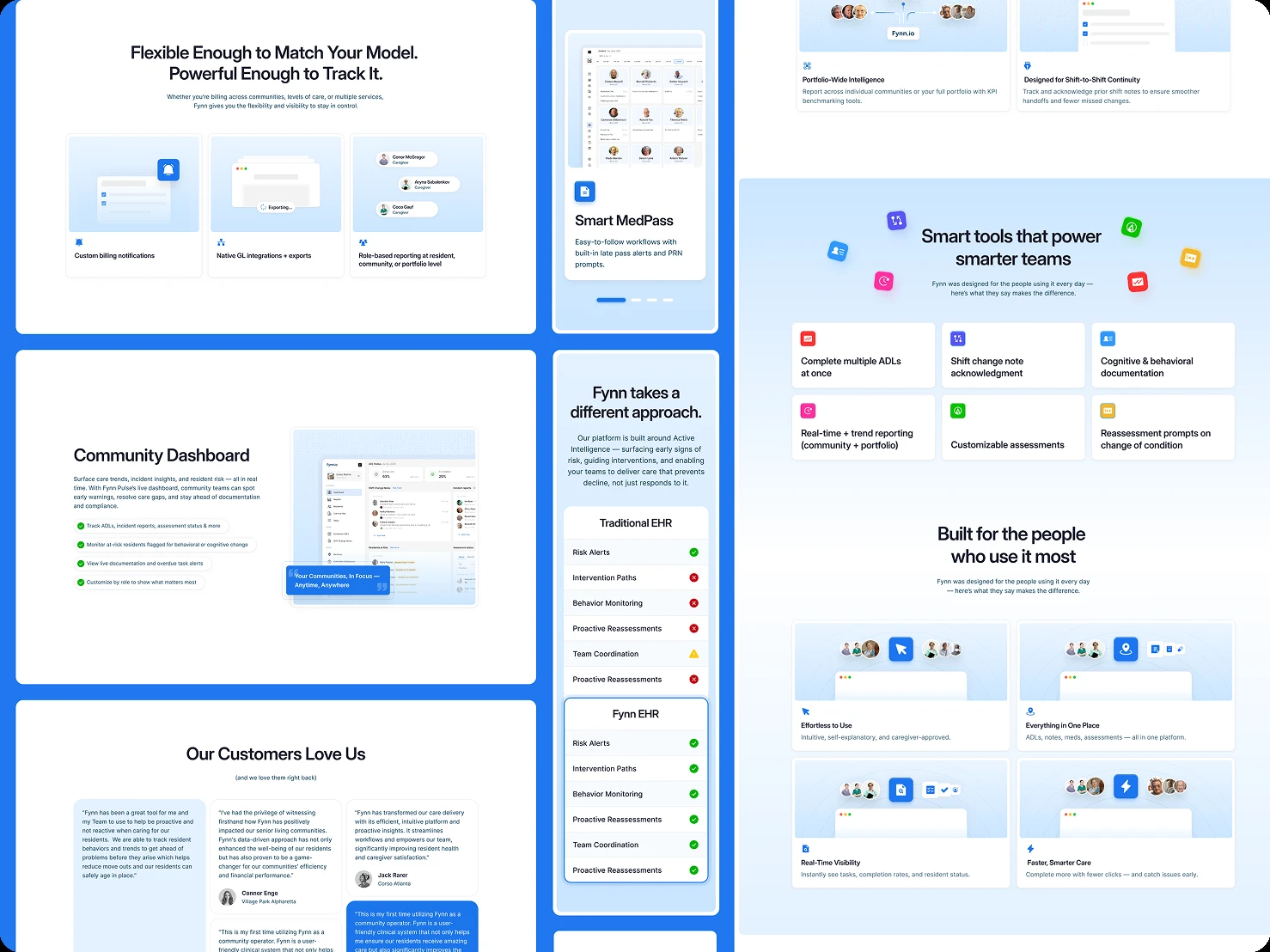
The new website featured clean layouts with generous whitespace, clear hierarchies that guided visitors toward conversion, and strategic use of the product's actual interface in context. We created sleek, minimalistic feature animations showcasing core functionalities like ADL Charting and Resident Profiles. These weren't decorative. They demonstrated real workflows in seconds, helping decision-makers immediately grasp the platform's value.
Every page was built around conversion. Clear calls-to-action appeared at natural decision points. No unnecessary elements cluttered the experience. The design prioritized what mattered: helping senior living facilities understand how Fynn would improve their operations, and making it easy to take the next step.
The technical foundation mattered just as much as the design.
We built the site in Webflow from Figma designs, prioritizing performance and flexibility. Page speed was optimized to ensure fast loading across all devices, critical when healthcare administrators are evaluating multiple solutions on tight schedules.
Responsive design ensured the experience worked flawlessly on mobile and tablet, where many facility managers do their research. Accessibility standards were baked in, making the site usable for everyone.
We implemented a CMS for Fynn's blog, giving their team autonomy to publish content without developer intervention. SEO improvements were woven throughout, from meta structure to content hierarchy, making it easier for the right prospects to find Fynn organically. Analytics integration provided visibility into how visitors moved through the site and where they converted, enabling continuous optimization.
The result was a website that finally matched the quality of the product behind it, a marketing presence that attracted the right audience, communicated value clearly, and converted visitors efficiently.
The impact
The redesign didn't just improve the interface. It transformed how caregivers worked.
Task completion times dropped significantly. Navigation became intuitive. Errors decreased as workflows became clearer and data entry more streamlined. Staff reported higher satisfaction, and so did residents, who benefited from caregivers having more time to focus on actual care.
"It's very easy to collaborate with Tenscope. The designs are thorough, and the way they are organized and shared is very detailed. This helps me understand where we're at with the design delivery."
Arianne Loveland, Product Owner at Fynn.io
Fynn's platform became what it promised to be: a tool that actually enhances caregiver efficiency instead of adding to their burden. The marketing animations elevated brand perception, and the product itself finally delivered on the vision of tech-driven, streamlined senior care.
When UX is built around real workflows, real constraints, and real people, it doesn't just improve metrics. It improves lives.
Related case studies