Building a complete design system across products, web, and marketing

AI governance is critical but invisible. Companies deploying AI systems need to ensure safety, compliance, and ethical standards. But governance work happens behind the scenes—validating prompts, checking for toxicity, monitoring data privacy, preventing regulatory violations. The importance is enormous. The visibility is minimal.
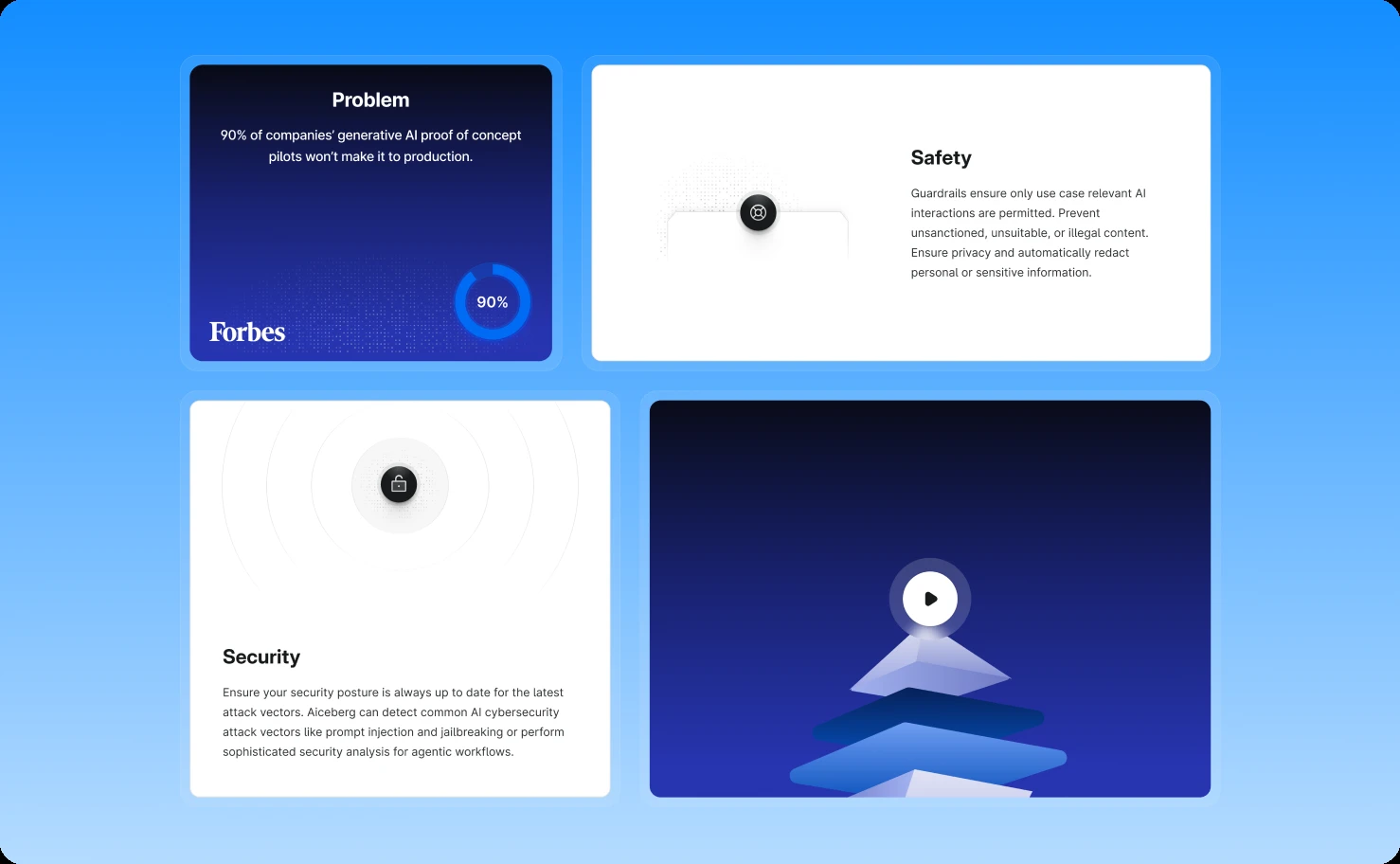
Aiceberg.ai built enterprise solutions to make AI governance manageable, OGMA for content validation and safety, SAGA for data management. Their technology was sophisticated. Their value proposition was clear to experts. But their visual identity didn't match their innovation.
The products felt dated. Outdated UI patterns. No cohesive design language. Functionality that worked but looked like it belonged in an earlier decade. For an AI company selling cutting-edge solutions, this visual-capability disconnect created credibility problems.
The website undersold their expertise. Generic layouts. Unclear value communication. Nothing that differentiated Aiceberg from dozens of other AI vendors making similar claims. Prospects couldn't see what made them special.
Marketing materials lacked polish. Pitch decks and sales assets didn't reflect the sophistication of the underlying technology. In competitive enterprise sales, presentation quality influences perception of product quality.
Aiceberg needed comprehensive visual transformation—not just one website redesign or one product refresh, but a complete design system spanning their entire digital presence. Products, website, marketing materials, everything needed to work together as a cohesive, modern brand.
Understanding the scope: product, web, and marketing alignment
Most design projects focus on one area. This required three simultaneous transformations that needed to feel unified.
Product design for OGMA and SAGA needed to serve technical users managing complex AI governance workflows. These aren't casual consumer apps. They're enterprise tools where users spend hours daily monitoring AI outputs, configuring validation rules, reviewing compliance reports, and investigating potential issues.
The interfaces needed depth and capability while remaining navigable. Technical power without overwhelming complexity.
Website design needed to communicate Aiceberg's value to multiple audiences—technical buyers evaluating features, executives assessing strategic fit, compliance officers checking governance capabilities. Each visitor needed to find their answers quickly.
The site needed to educate prospects on AI governance challenges while positioning Aiceberg's solutions as sophisticated responses.
Marketing materials faced intense scrutiny in enterprise sales cycles. Pitch decks get reviewed by technical teams, shared with stakeholders, and compared against competitors. Sales assets represent the company in rooms where Aiceberg's team isn't present.
These materials needed visual authority that reinforced rather than undermined the message.
The common thread: everything needed to feel like it came from one innovative, professional company at the forefront of AI governance.
Building the foundational design system
Before redesigning anything, we needed infrastructure that could support consistency across all applications.
Scalable design system with theme flexibility
We developed a comprehensive design system from scratch—components, patterns, typography, color systems, spacing rules, interaction behaviors. But unlike single-application design systems, this one needed to work across three distinct contexts with different requirements.
The system's defining feature: built-in support for dark and light modes from the foundation. Not as an afterthought or add-on, but as core architecture.
For technical products like OGMA and SAGA, dark mode isn't cosmetic preference—it's practical necessity. Users monitoring AI outputs for hours need interfaces that reduce eye strain. Many technical professionals strongly prefer dark interfaces for extended work sessions.
For the website, theme flexibility serves accessibility and user preference. Some visitors find dark modes easier to read. Others prefer light. Supporting both removes barriers and demonstrates Aiceberg's attention to user needs.
The design system ensures both themes maintain proper contrast ratios, readability standards, and visual hierarchy. Components look intentionally designed in both modes, not like automatic inversions.
Visual consistency that scales
Every component, from buttons to data tables to navigation patterns, was designed once and documented thoroughly for reuse across all applications.
This systematic approach delivered multiple benefits:
Development efficiency. Build components once, deploy everywhere. Changes to core patterns propagate automatically across products, website, and marketing templates.
Brand consistency. Users moving between Aiceberg's website and products encounter familiar patterns. The visual language stays constant, building recognition and trust.
Quality maintenance. Updates happen systematically rather than ad-hoc. Accessibility improvements in the design system improve everything simultaneously.
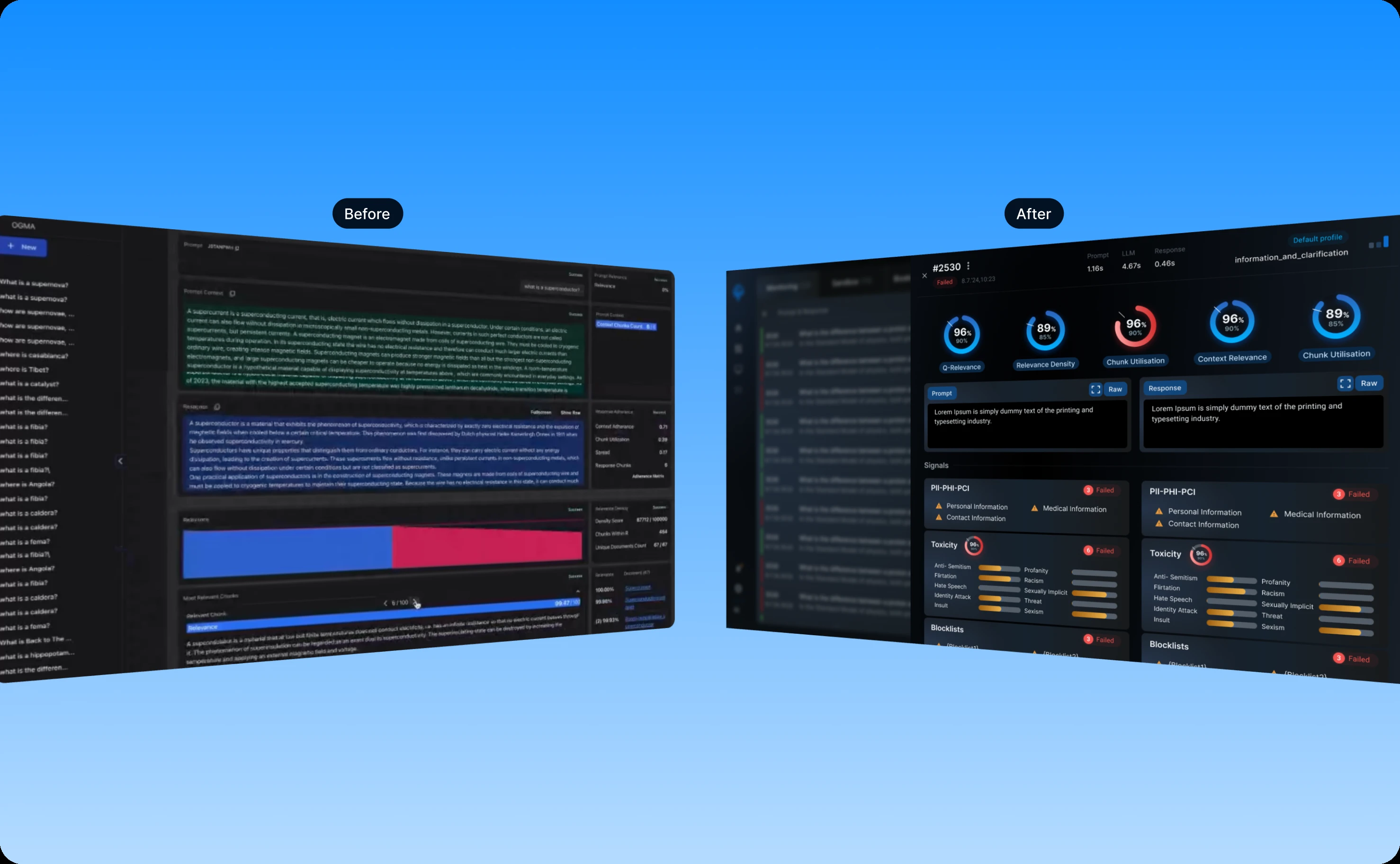
Redesigning OGMA: making AI governance navigable
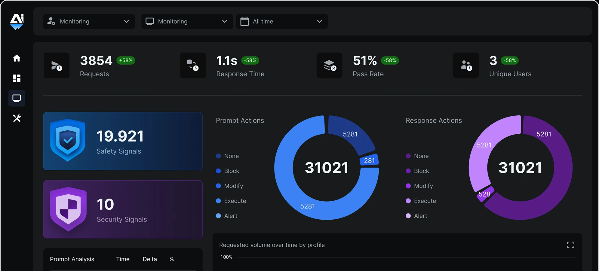
OGMA validates AI-generated content against comprehensive criteria, relevance, toxicity, data privacy compliance, context adherence, prompt injection risks, regulatory violations. This monitoring complexity could easily become interface chaos.
Navigation that surfaces priorities
We redesigned OGMA's navigation around user workflows rather than technical architecture. The interface guides users to what matters most: active governance issues, systems requiring attention, compliance reports due soon, unusual patterns detected.
The dashboard provides immediate visibility into governance health. Are all AI systems operating within safety parameters? Any toxicity spikes? Data privacy concerns? Users can assess overall status at a glance before drilling into specifics.
Governance monitoring interface
The core governance interface presents validation metrics clearly without overwhelming users. Color-coding highlights issues requiring attention while keeping normal operations visually quiet.
Toxicity detection, data privacy compliance, prompt validation, and response quality appear as organized streams of information. Users can filter by severity, system, time range, or specific validation criteria.
Each issue provides context immediately—what triggered the flag, why it matters, what action is recommended. Users don't need to decode technical alerts. The interface explains problems in plain language.
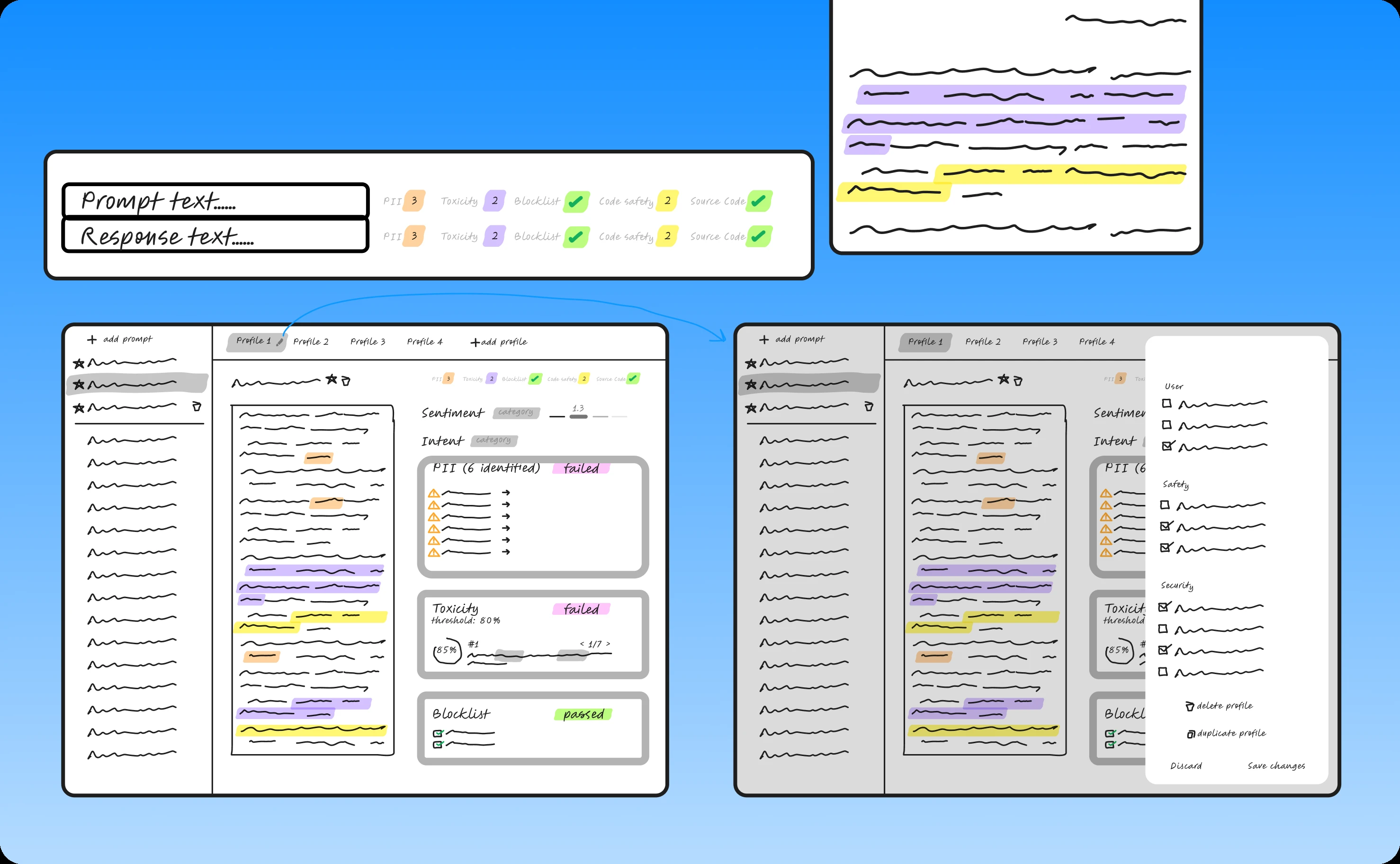
Signal reporting and investigation
When governance systems detect potential issues, investigation needs to happen quickly. The reporting interface provides drill-down capabilities without getting lost in nested screens.
Click an alert, see full context: the original prompt, the generated response, which validation rules failed, confidence scores, related patterns across other systems, and recommended actions.
This transforms investigation from detective work into guided analysis. Users follow clear paths from signal to understanding to resolution.
Dark mode as working environment
OGMA's dark mode isn't just aesthetic variation—it's the primary interface for many users. The color system in dark mode maintains all the same information hierarchy as light mode while reducing eye strain during extended monitoring sessions.
Critical alerts still demand attention. Normal operations remain visible but calm. The interface supports focused work for hours without fatigue.
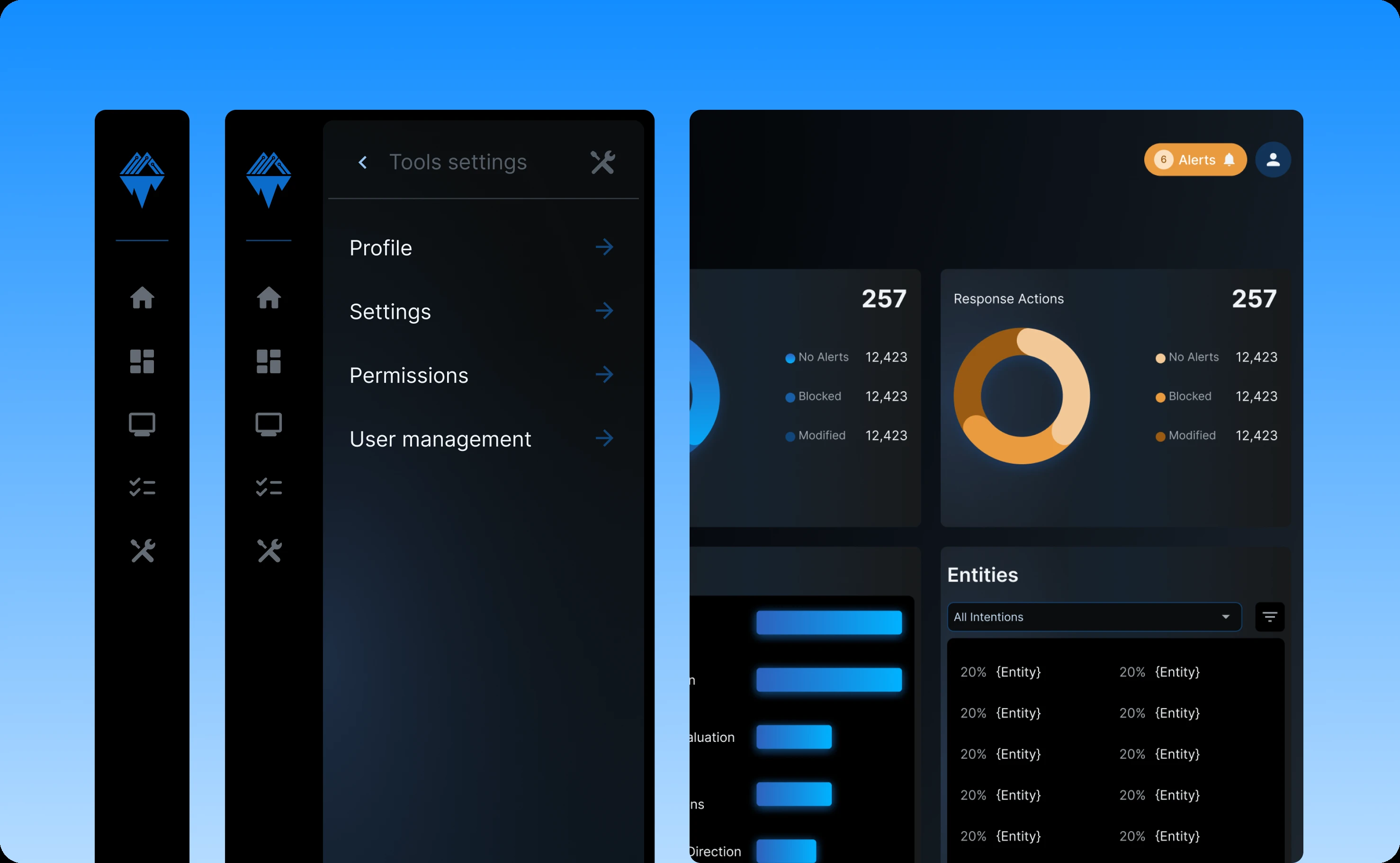
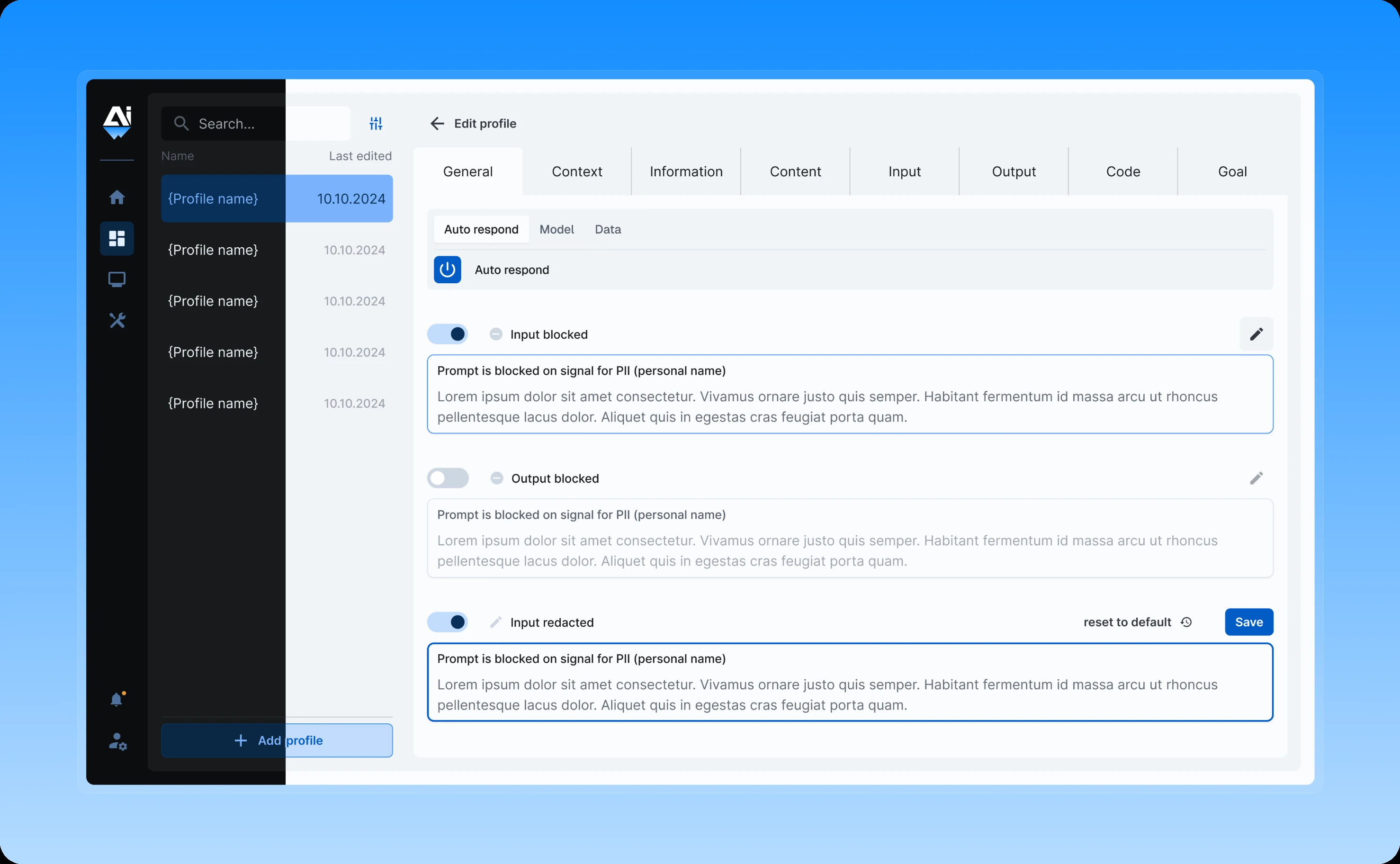
Applying consistent design to SAGA
SAGA handles AI data management with different workflows than OGMA but needed to feel like part of the same product family.
We applied the design system's patterns and components to SAGA, adapting them appropriately for data management contexts while maintaining visual consistency with OGMA.
Users working across both products encounter familiar interaction patterns. Navigation follows the same logic. Components behave predictably. The learning curve between products essentially disappears.
Both products support seamless dark/light mode switching, allowing users to choose their preferred working environment for each application independently.
Redesigning the website to communicate innovation
Aiceberg's website needed to do several jobs simultaneously: educate prospects on AI governance, explain how OGMA and SAGA solve these challenges, and establish Aiceberg as an authoritative voice in the space.
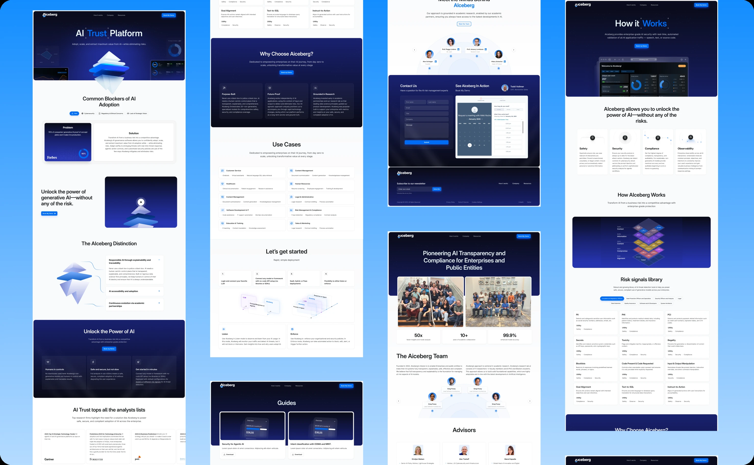
Homepage that establishes positioning
The homepage immediately articulates Aiceberg's mission and value proposition. Visitors understand within seconds: this company helps enterprises ensure their AI systems are safe, compliant, and ethical.
Key products—OGMA and SAGA—appear prominently with clear descriptions of what each does and who it serves. The layout guides visitors toward relevant information based on their role and needs.

Dedicated product pages with depth
Each product gets comprehensive coverage in dedicated pages. These aren't just feature lists—they're education resources explaining the governance challenges, how the product addresses them, specific capabilities, use cases, and benefits.
The pages serve both technical evaluators who need capability details and executives who need strategic context. Information hierarchy ensures each audience finds what they need without wading through irrelevant content.
Visual storytelling through design
The website uses clean, modern design language that signals innovation without sacrificing clarity. Strategic use of whitespace. Typography that guides attention. Visual hierarchy that makes scanning effortless.
Custom graphics illustrate complex concepts, how OGMA validates AI outputs, how SAGA manages data flows, making technical capabilities understandable at a glance.
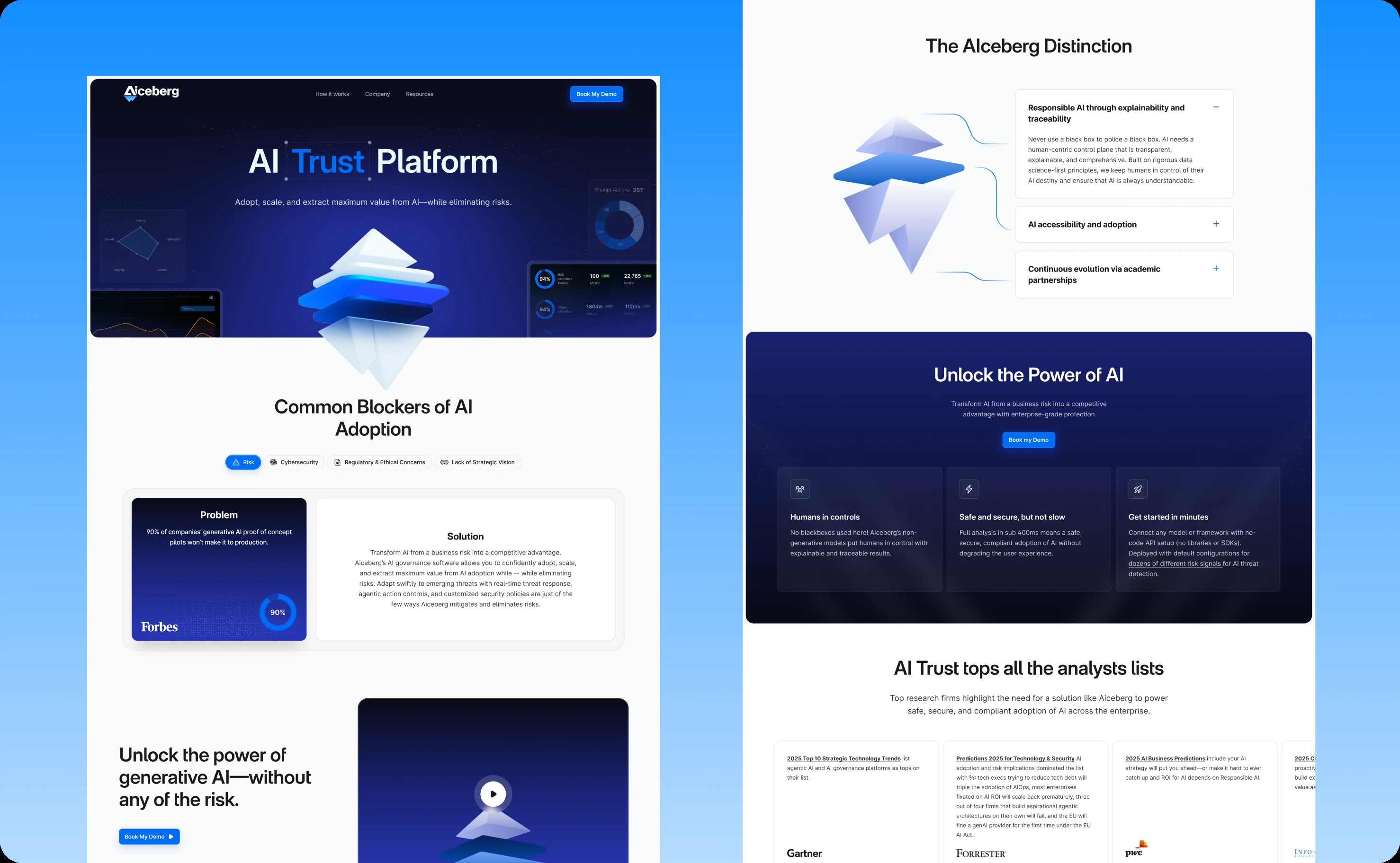
Elevating marketing materials to match product sophistication
Enterprise sales cycles involve multiple stakeholders reviewing materials repeatedly. Pitch decks get forwarded to technical teams, financial decision-makers, and compliance officers. Each audience evaluates not just content but presentation quality.
Pitch decks that command attention
We created polished pitch decks following the established design system but optimized for presentation contexts.
Slides emphasize key messages through visual hierarchy. Complex information gets broken into digestible sections. Product capabilities appear with supporting visuals that clarify rather than decorate.
The decks work equally well in formal presentations and as leave-behind materials prospects can review independently.
Sales and marketing assets with consistency
Brochures, one-pagers, case study templates, and other sales materials all follow the same visual language as products and website.
This consistency reinforces brand recognition. Prospects moving from website to sales conversation to product demo encounter coherent visual identity. Everything feels like it comes from one sophisticated, professional company.
Implementation through collaborative iteration
The comprehensive scope required tight collaboration and rapid iteration.|
Discovery and research involved user interviews with OGMA and SAGA users to understand pain points, workflow priorities, and feature importance. This research directly informed design decisions about navigation, information hierarchy, and dark mode implementation.
Design QA ensured pixel-perfect implementation across all applications. We reviewed every component, screen, and interaction to verify designs matched specifications and maintained quality in both light and dark modes.
Iterative testing caught usability issues early. Regular feedback loops with Aiceberg's team kept work aligned with their vision and user needs.
When we did receive feedback for improvement, we always had very quick turnaround times with your team.
Alexander Schlager, CEO at Aiceberg
What the transformation delivered
The comprehensive redesign established Aiceberg's visual identity and elevated their market presence.
Products feel modern and capable. OGMA and SAGA now match their technical sophistication with interface sophistication. The dark/light mode flexibility serves real user needs, increasing satisfaction and accessibility.
The website communicates innovation effectively. Prospects visiting Aiceberg.ai see a company at the forefront of AI governance, not a generic vendor. Clear value communication helps visitors understand capabilities quickly.
Marketing materials command credibility. Pitch decks and sales assets now reflect the quality of Aiceberg's technology. Visual polish supports rather than undermines the sales narrative.
Brand consistency builds trust. The unified design language across products, website, and marketing creates cohesive brand experience. Recognition builds faster. Trust develops more readily.
Aiceberg now presents itself as the sophisticated AI governance company they always were technologically but couldn't communicate visually before.
The power of comprehensive design transformation
This project demonstrates that piecemeal design improvements can't achieve what systematic transformation delivers.
Redesigning just the website would have created disconnect when prospects evaluated products. Modernizing just products would have left marketing materials undermining sales conversations. Updating just marketing without fixing products would have created expectations the actual experience couldn't meet.
Comprehensive transformation—products, website, marketing, all working from one design system—creates synergy. Each element reinforces the others. The whole becomes greater than the sum of its parts.
The dark/light mode implementation across all touchpoints shows how foundational design decisions create cumulative value. Building theme flexibility into the core system meant every application benefited automatically. Users get choice and accessibility everywhere they interact with Aiceberg.
For companies whose visual identity doesn't match their capabilities, comprehensive transformation isn't luxury—it's competitive necessity. Aiceberg's technology was always cutting-edge. Now their entire brand presence reflects that reality.
Related case studies