Extending enterprise software to where users actually work

Tax season creates stress everyone recognizes. Shoebox full of receipts. Missing documents. Endless back-and-forth with CPAs. Questions that need answers now but won't get responses until tomorrow. The process feels stuck in a previous decade because, in many ways, it is.
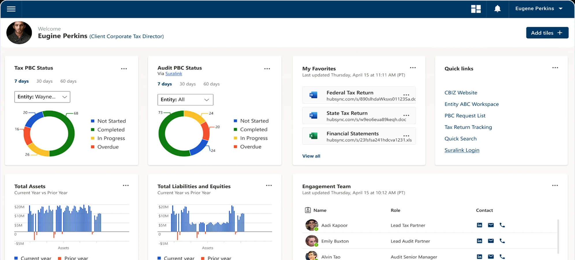
HubSync built enterprise tax automation software that modernized workflows for top CPA firms. Their platform digitized processes that had relied on paper, email attachments, and manual data entry for decades. The technology worked brilliantly—on desktop.
But taxpayers don't live at desks anymore. They snap photos of W-2s during lunch breaks. They remember tax questions while commuting. They need to upload documents from coffee shops, not offices. The friction wasn't HubSync's platform capabilities—it was the context mismatch between where the software lived and where users actually worked.
HubSync needed mobile access that wasn't just their desktop experience crammed into a smaller screen. They needed a purpose-built mobile app that understood how people actually handle taxes in 2024: on phones, on the go, in moments stolen between other obligations.
They also needed a website redesign that could communicate their value to enterprise CPA firms while maintaining consistency with the new mobile experience.
Understanding tax preparation in mobile contexts
Tax preparation isn't naturally mobile. It requires documents, focus, and often multiple sessions as information becomes available over weeks or months.
But key moments in the tax preparation process are perfectly suited for mobile:
Document capture happens wherever documents appear. W-2s arrive in the mail.1099s get opened at kitchen tables. Receipts accumulate in wallets and car consoles. Having to save everything until sitting at a computer creates delay and increases loss risk. Mobile document scanning eliminates that friction.
Questions arise at unpredictable moments. Taxpayers remember tax-related questions while doing completely unrelated tasks. Writing those questions down for later means many never get asked. Direct messaging with CPAs from mobile devices closes that communication gap.
Progress tracking reduces anxiety. Tax season stress stems partly from uncertainty about completion status. Being able to check progress during any free moment—seeing what's done, what's pending, what's still needed—provides psychological relief even when not actively working on taxes.
Quick updates happen in small windows. Answering a simple questionnaire question or uploading one document doesn't require dedicated computer time. These micro-tasks fit perfectly into brief moments that mobile contexts enable.
Through collaboration with HubSync's tax experts and research into taxpayer behavior, we identified which platform functions translated well to mobile and which needed mobile-specific reimagining.
Designing mobile-first tax workflows
The mobile app wasn't a port of desktop features. It was a rethinking of which tasks mobile contexts enable and how to make those tasks effortless.
Onboarding and progress visibility
Tax preparation spans weeks or months with irregular engagement. Users need to understand status instantly when opening the app, not reconstruct context from memory.
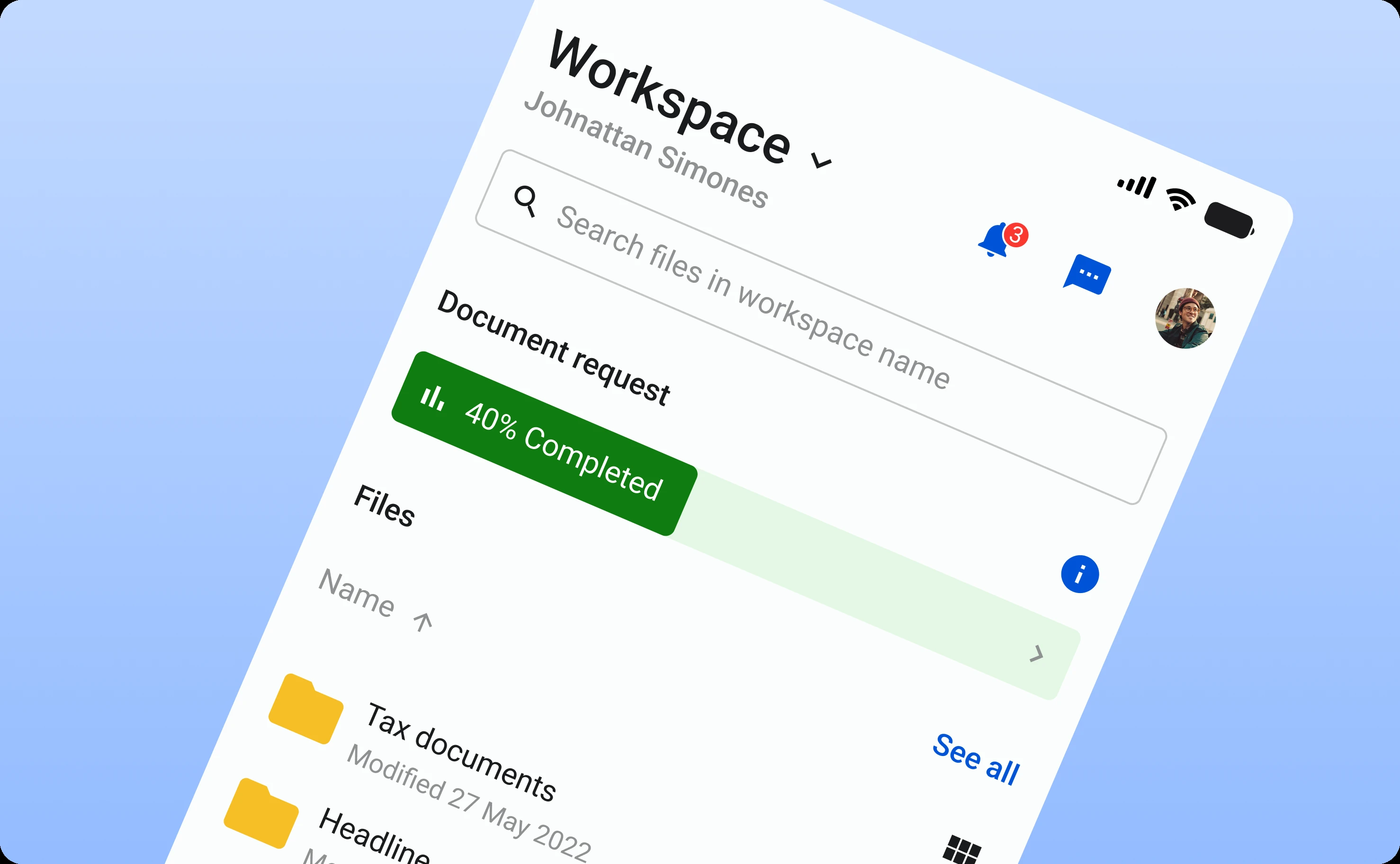
The home screen features a prominent progress bar showing overall completion status. Below that, a personalized checklist breaks the tax return into concrete steps with clear completion states. Users can see immediately: "I've uploaded W-2 and mortgage interest statement. I still need to provide charitable donation receipts and answer questions about investment income."
This transforms abstract anxiety ("Am I making progress?") into concrete understanding ("I'm 65% complete. Three tasks remain.").
Document scanning that actually works
Most mobile document scanning feels like a technical achievement that barely functions in practice. Lighting issues. Blurry captures. Crop adjustments. Files that upload but aren't readable.
We designed the scanner around reliability and simplicity:
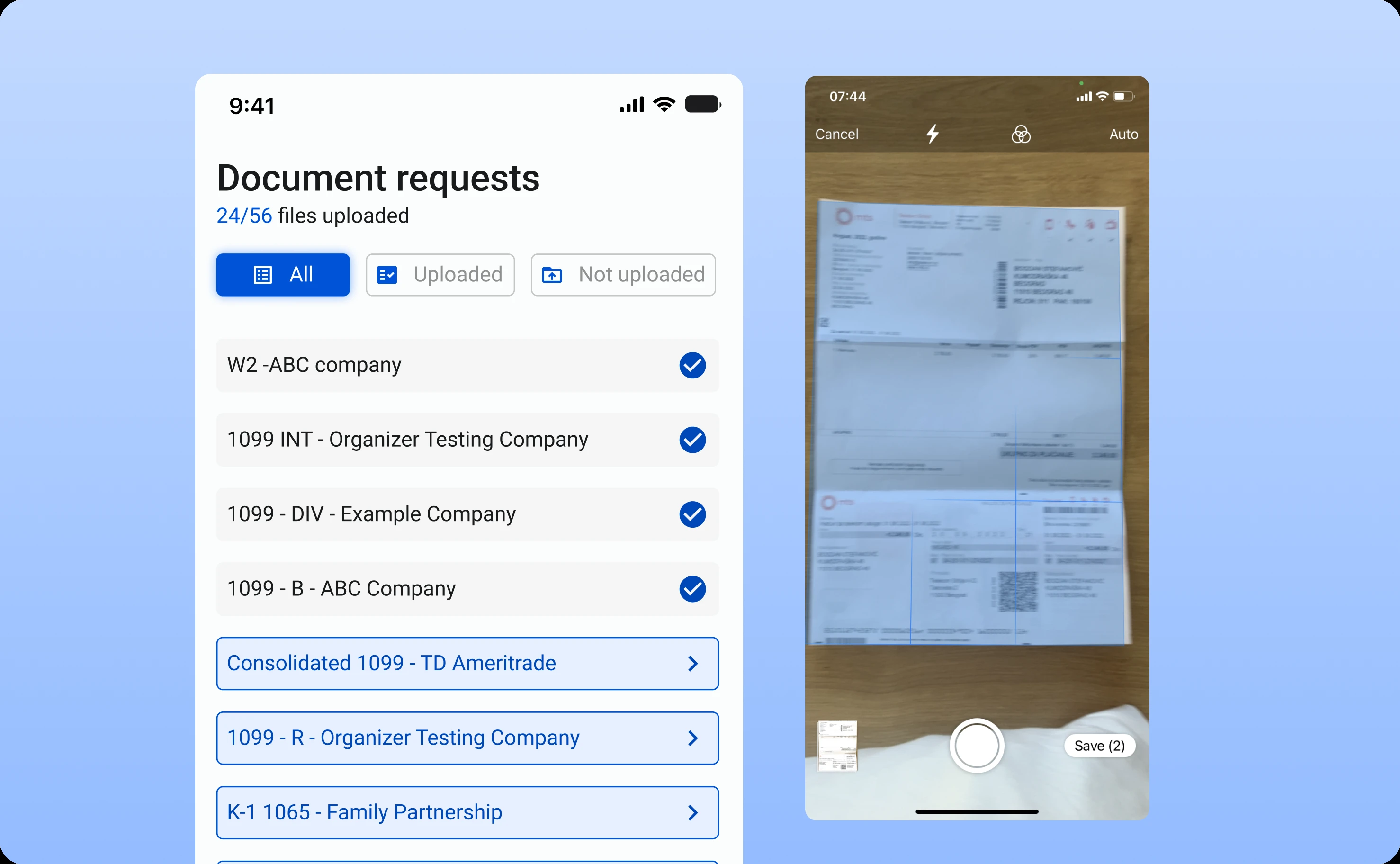
The camera interface guides proper document framing. Visual indicators show when the document is positioned correctly, lit adequately, and in focus. Users don't need to guess whether their photo will be usable.
Automatic upload and storage happen immediately after capture. No save/export/upload sequence. Take photo, done. The document appears in HubSync's system automatically, organized by category.
Visual filters show upload status across all required document types. Green indicators for uploaded. Red for still needed. Users can scan the list and know instantly what documentation gaps remain.
This isn't fancy technology, it's thoughtful UX that makes a technically complex process feel simple and reliable.
Questionnaires optimized for small screens
Tax questionnaires on desktop can present multiple questions simultaneously with complex conditional logic. Mobile screens don't afford that density.
We redesigned questionnaires around progressive disclosure and mobile-appropriate question formatting. One question appears at a time with clear, concise language. Input types match the data being collected, numeric keyboards for amounts, date pickers for dates, toggle switches for yes/no questions.
Progress indicators show position within the questionnaire. Users know whether they're answering question 3 of 8 or 67 of 89—managing expectations about time commitment.
The interface prevents errors through validation and helpful context. Entering a mortgage interest amount that seems unusually high? A gentle prompt double-checks: "This is larger than typical. Please confirm this amount is correct."
Direct CPA messaging
The communication gap between taxpayers and accountants creates most tax season frustration. Questions go unanswered for days. Clarifications require multiple email exchanges. Time-sensitive issues miss deadlines.
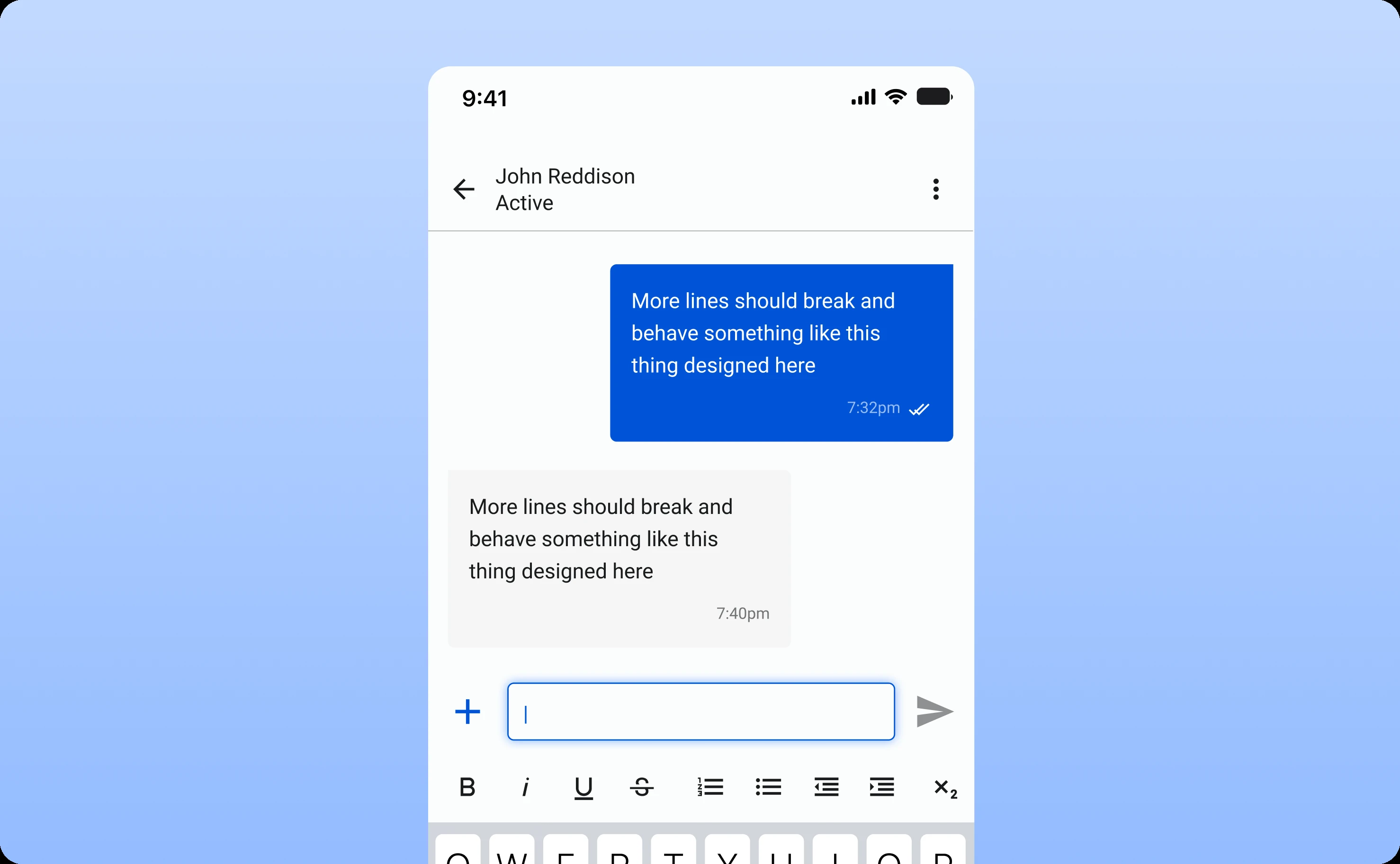
We built messaging directly into the mobile app. Taxpayers can message their CPA with context about specific documents or questions. CPAs respond through the platform. The entire conversation thread stays attached to the relevant tax return, creating useful history for future reference.
Notifications alert users to new messages without requiring constant app checking. The conversation feels synchronous even when responses aren't immediate.
This transforms the taxpayer-CPA relationship from distant and formal to accessible and collaborative.
Maintaining consistency across platforms
HubSync needed mobile capabilities without fragmenting their brand or creating disconnected user experiences.
Visual language alignment
The mobile app's design language mirrors the desktop platform while adapting appropriately to mobile contexts. Color schemes, typography, iconography, and interaction patterns feel like the same product family.
This consistency matters for CPAs using both desktop and mobile interfaces. They don't relearn the product when switching contexts—they apply existing mental models to new surfaces.
Information architecture coherence
Feature organization on mobile follows desktop patterns where appropriate. Users who understand how document organization works on desktop find the same logic on mobile. Navigation that differs does so for valid contextual reasons, not arbitrary design decisions.
Redesigning the website for enterprise credibility
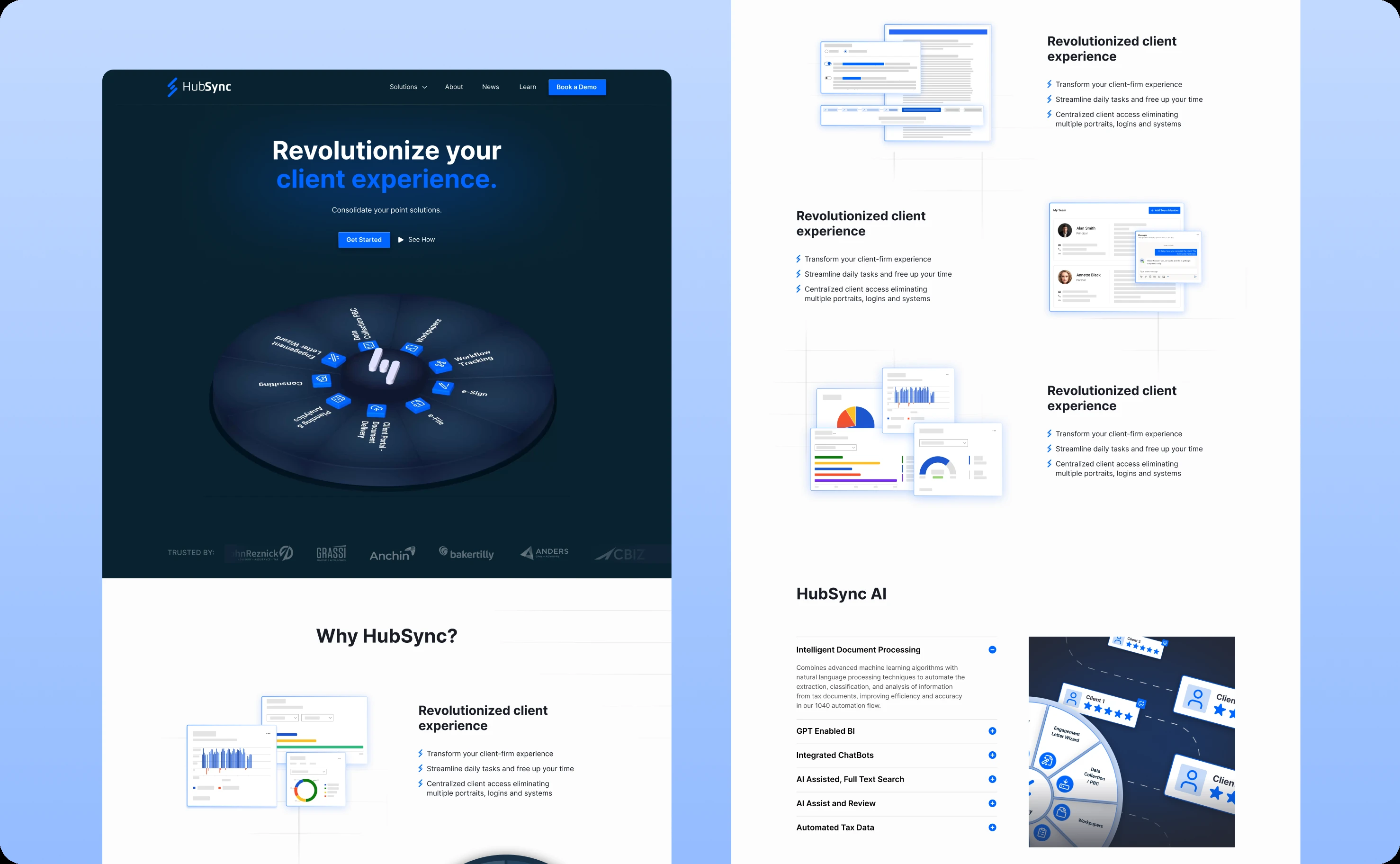
While building the mobile app, we also redesigned HubSync's website to better communicate their enterprise value proposition.
Contemporary aesthetic that signals innovation
The tax industry isn't known for design excellence. Most tax software websites feel dated, cluttered, and intimidating. This aesthetic carries implicit messages: "We're old-school. We're complicated. We're not keeping up with modern expectations."
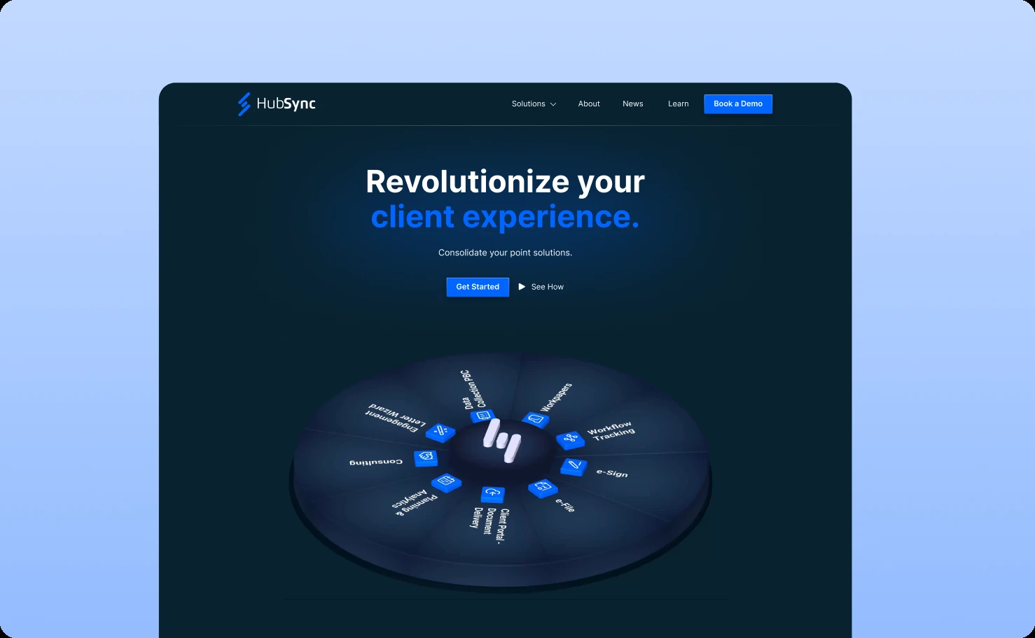
We designed HubSync's website around minimalist contemporary aesthetics. Generous whitespace. Clean typography. Strategic use of color. Sophisticated without being cold. Professional without being boring.
This visual approach signals immediately: "We're modernizing the industry. We understand current design standards. We're not your grandfather's tax software."
Clear value communication
Enterprise software websites often bury their value proposition under jargon and feature lists. Prospects visiting HubSync's site needed to understand within seconds: what does this do, and why does it matter to my firm?
Landing pages articulate HubSync's mission clearly. The team's expertise—founded by an ex-Global CIO of KPMG—establishes credibility immediately. Product advantages appear in digestible highlights rather than overwhelming specifications.
Conversion-optimized flow
The website guides visitors toward one clear action: scheduling a product demo.Prominent call-to-action buttons appear at natural decision points throughout the site.
The demo scheduling process is friction-free, no long forms, no aggressive sales tactics, just easy access to seeing the product in action.
This design acknowledges how enterprise software purchasing actually works. Decision-makers don't buy from websites, they evaluate through demos and trials. The website's job is facilitating that next step, not trying to close deals independently.
Collaboration that compressed timelines
Building a mobile app from scratch while redesigning a website typically takes six months or more. We completed both in three months through intensive collaboration.
Collaborative workshops established clear goals upfront. Rather than iterating through misalignment, we invested time ensuring shared understanding of objectives, constraints, and priorities before design began.
Close partnership with HubSync's development team enabled smooth handoff and realistic design decisions. We designed knowing what could be built in available timeframes. Developers implemented understanding the design rationale behind decisions.
Regular feedback loops kept work aligned. We didn't disappear for weeks and return with complete designs. We shared progress continuously, incorporated feedback immediately, and adjusted direction based on what testing revealed.
Clear roadmap and milestones created accountability and momentum. Everyone knew what needed completion when. Dependencies were mapped. Blockers surfaced early.
This collaborative intensity requires commitment from both sides but compresses timelines dramatically while improving outcomes.
What launched and what it accomplished
The mobile app launched to immediate adoption. Thousands of taxpayers now use it as their primary interface with the tax preparation process.
Document upload friction essentially disappeared. Taxpayers capture documents the moment they arrive rather than accumulating stacks for later scanning sessions. This increases completion rates and reduces last-minute scrambles.
CPA-client communication improved measurably. Response times shortened. Question resolution accelerated. The relationship feels more collaborative and less transactional.
Tax season stress decreased for users. The ability to check progress anytime, handle small tasks in brief moments, and stay connected to their accountant transformed tax preparation from a dreaded marathon into manageable micro-sessions.
HubSync strengthened its competitive position. The mobile app became a key differentiator for CPA firms evaluating tax automation platforms. Having genuinely good mobile access isn't common in the industry. It's now a core part of HubSync's value proposition.
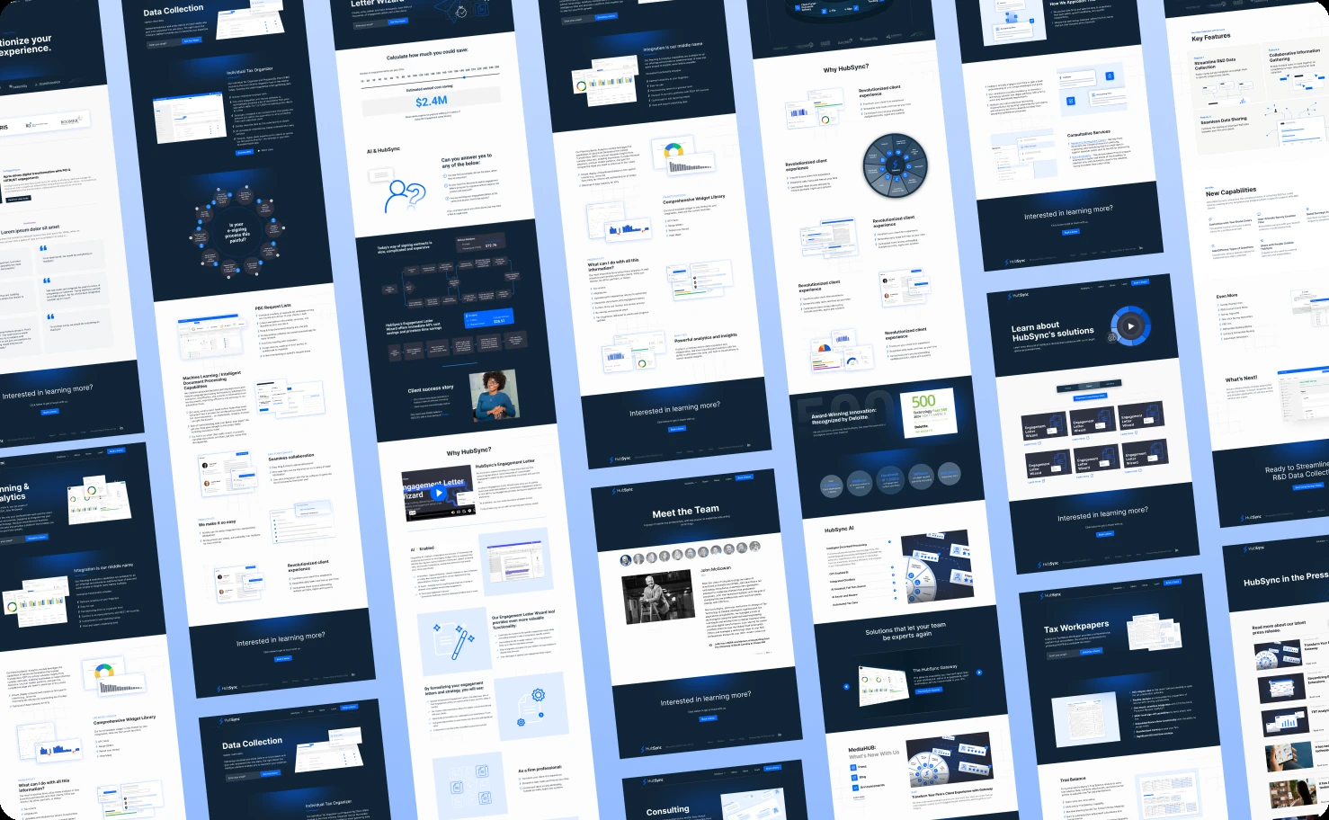
The website successfully communicates enterprise credibility while maintaining visual consistency with the mobile experience. Prospects understand HubSync's sophistication and innovation immediately.
“I have felt that they are a partner to us in the work we’re trying to get done versus an ad-hoc consultant that we need whenever.”
Betsy Weissman, CMO at HubSync
The broader pattern
This project demonstrates that mobile isn't just desktop on smaller screens. Effective mobile experiences require understanding mobile contexts and designing specifically for how people actually use devices throughout their day.
Tax preparation seems like poor fit for mobile because the entire process is complex. But within that complexity exist numerous micro-tasks perfectly suited for mobile execution. Identifying those tasks and designing excellent mobile experiences around them adds enormous value without trying to cram everything mobile.
The collaboration approach—intensive partnership, clear communication, regular feedback—proves that aggressive timelines don't require sacrificing quality. They require commitment to alignment and rapid iteration.
HubSync's mobile app isn't an add-on feature. It's now core platform infrastructure reshaping how thousands of people experience tax preparation. That's what happens when mobile design understands context rather than just shrinking desktop.
Related case studies
Creating an e-commerce platform that small merchants can actually use
