
Crafting a Seamless User Journey: Elevating Sapio365 with User-Centric Design

Product Redesign
Creative
Web Design
Mission
We revitalized Ytria's Sapio365 to better serve IT admins managing Microsoft 365. Our ground-up redesign focused on making the tool more intuitive while integrating Microsoft's Fluent design system.
Outcome
The redesign transformed Sapio365's core features - from session management to dashboard interfaces. Key improvements include:
- Streamlined onboarding
- Optimized dashboard and job management
- Enhanced visual design that aligns with Microsoft's ecosystem
Impact
IT admins report major improvements in usability and productivity with Sapio365's redesign. Higher user satisfaction has boosted adoption and retention, strengthening Ytria's position in Microsoft 365 management.
Our intuitive design transforms Sapio365 into a powerful tool that meets modern IT needs while maintaining simplicity.
Partnering with Ytria to Elevate Sapio365
Ytria needed to modernize Sapio365's interface to meet evolving IT admin needs. As a crucial Microsoft 365 management tool, it demanded both reliability and visual appeal.
Our redesign reduced PowerShell dependency while enhancing key features: multi-tenant visibility, bulk operations, custom reporting, and security management. The result? Faster, more confident task completion for IT admins.

Building the Foundation for a Smooth Experience
As a Windows-native app, Sapio365 excels at handling large data volumes. We enhanced its interface by introducing web technologies and Microsoft's Fluent design system - a familiar environment for our users.
This strategic choice sped up development and created a more intuitive experience, driving user satisfaction and adoption.
Designing a Welcoming Onboarding Flow
We spotted a key issue: users skipping license activation faced unclear feature limitations on the home screen. This insight led us to redesign the home screen for better clarity.

We made all features instantly visible at login and polished the onboarding experience, helping users get started faster with a more engaging introduction to Sapio365.
Streamlining Session Management for Maximum Efficiency
Sapio365's multi-session feature lets users manage different organizations simultaneously. But the cluttered top navigation bar made it hard to track active, open, and past sessions effectively. Users needed a clearer way to handle their multiple sessions.

We moved session management to a dedicated left sidebar with a clear hierarchy:
- Active sessions at the top with quick access to options
- Open sessions below for easy switching
- Recent sessions in an expandable section
This cleaner layout helps users manage multiple tasks more efficiently.
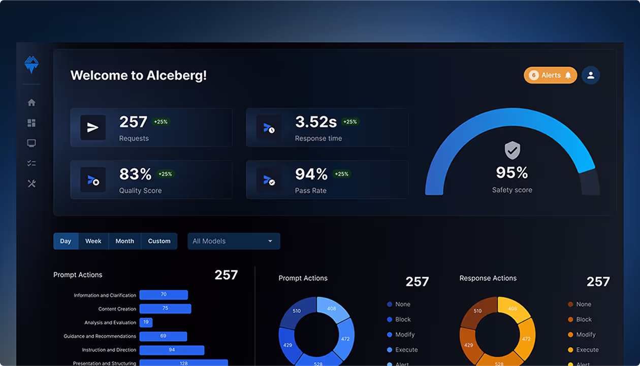
A Personalized Dashboard for Informed Decisions
The dashboard is your first stop after onboarding, with features that adapt to your license status. Licensed users get instant data access through quick shortcuts, plus helpful numerical counters for at-a-glance insights.

A new right-side panel keeps important tools at your fingertips, showing schedules, custom jobs, and key metrics. This puts essential information where you need it, making your workflow smoother.
Empowering Automation with Intuitive Job Design
Sapio365's jobs feature handles complex data tasks through simple shell scripts - no coding expertise needed. Beyond standard management tools, it offers custom operations that boost your productivity.

We revamped the job interface with better navigation, search, and filtering. A new right-side panel shows job details and includes scheduling features. Users can now easily manage favorites, customize jobs, and access common operations - making automation more accessible.
Creating an Intuitive Report Generation Experience
Initially, generating reports in the app was not user-friendly. Users faced the cumbersome task of navigating through extensive job listings or searching by name to initiate report creation. Recognizing that this process created unnecessary friction, we decided to make a significant change.

Report generation now has its own dedicated space, making it easier to create and customize reports. This change transforms a previously underused feature into an accessible, powerful tool.
Transforming Raw Data into Actionable Insights
We revamped Sapio365's data grid for better usability, focusing on clearer data presentation and improved job center functionality for smoother data handling.

Key improvements include clearer job scoping - showing which actions affect all records versus selected entries. We enhanced data views with better grouping and visibility features for more intuitive management.
Final Thoughts
Our Sapio365 redesign shows how user-centered design elevates enterprise software. Adopting Microsoft's Fluent system improved familiarity and navigation, while positive user feedback and increased adoption prove the impact of thoughtful UX improvements.
This project demonstrates our commitment to design that makes technology more efficient and intuitive for users.
Thanks to Ytria's deep user insights and our collaborative approach, we simplified complex features without losing power. User testing revealed blind spots and shaped better solutions. The team is excited to see users benefit from these improvements.


Ready to scale faster with a product design subscription?


